
TL;DR
- 67% of executives can’t interpret their company dashboards. This guide shows you what actually works
- NASA’s 3D asteroid tracker proves when complex visualizations beat simple charts (and when they don’t)
- The 10-second rule: If your audience needs longer, your visualization has already failed
- FiveThirtyEight’s election forecasts reveal why showing uncertainty matters more than showing predictions
- ProPublica’s surgeon scorecard demonstrates how simple bar charts save lives when the stakes are high
- Three catastrophic failures: Why 3D pie charts, rainbow heatmaps, and dual-axis charts destroy comprehension
- The shocking truth: Million-dollar dashboards lose to well-designed Excel charts every time
Most data visualizations fail their audience in the first three seconds.
After reviewing 200+ data visualization examples from Fortune 500 dashboards, Information is Beautiful Award winners, and real-world projects driving million-dollar decisions, I discovered something surprising. The visualizations that actually work, the ones that change executive decisions, inform policy, and drive revenue, aren’t the most technically sophisticated or visually impressive.
They’re the clearest.
I’ve spent eight years building analytics solutions for enterprise clients across healthcare, retail, and financial services. I’ve watched a $2 million interactive dashboard get ignored while a simple annotated line chart transformed an entire go-to-market strategy. I’ve seen executives make wrong decisions because their “state-of-the-art” visualization obscured the truth behind impressive visual effects.
This guide breaks down 10 data visualization samples that succeed where most fail.
Quick Answer:
The best data visualization examples in 2025 share four traits: immediate clarity (understood in under 10 seconds), honest representation (proportional scales, clear axes), purposeful design (every element serves the insight), and real-world utility (enables better decisions). This guide analyzes 10 examples from NASA, FiveThirtyEight, ProPublica, and others that demonstrate these principles in action.
1. NASA’s Eyes on Asteroids: When 3D Actually Makes Sense
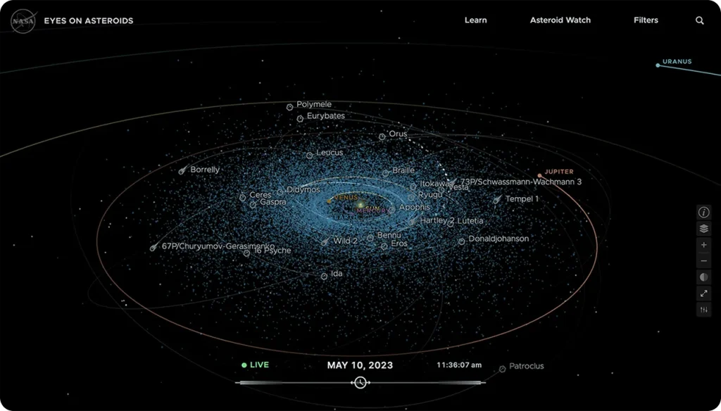
Source: NASA’s Eyes on Asteroids
What it shows: Real-time positions and trajectories of thousands of near-Earth asteroids in an interactive 3D solar system view.
I spent twenty minutes exploring NASA’s asteroid tracker the first time I found it, and it completely changed how I think about matching visualization type to data structure.
Here’s what NASA did right. They’re showing real-time positions and trajectories of thousands of near-Earth asteroids in an interactive 3D environment. This isn’t 3D for the sake of looking cool. Asteroid trajectories involve four dimensions (three spatial coordinates plus time), which is literally impossible to show effectively in 2D.
The interface uses gaming-style controls. WASD keys move your viewpoint, mouse controls rotation, and clicking any asteroid brings up its orbital data. This isn’t accidental. NASA deliberately chose interaction patterns that millions of people already know from video games.
The lesson I took from this: when your data has inherent dimensionality, match your visualization to those dimensions. Don’t force 3D data into 2D charts just because they’re easier to create. I now ask myself, “What is the natural shape of this data?” before I touch any design tools.
This thinking applies whether you’re choosing between simple bar charts or complex 3D models, which I explore further in my guide to data visualization techniques.
2. Visual Capitalist’s Pandemic Timeline: The Power of Historical Context
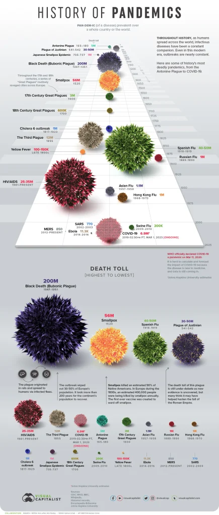
Source: Visual Capitalist’s Pandemic Timeline
What it shows: Every major pandemic in human history on a single timeline, with deaths represented proportionally and color-coded by pathogen type.
I’ve referenced this visualization in three different client presentations because it does something remarkable. It makes COVID-19 simultaneously significant AND contextualized.
The design shows every major pandemic in human history on a single timeline. Vertical position represents time (oldest at bottom, newest at top). Horizontal width represents the death toll proportionally. This means the 1918 Spanish Flu immediately dominates the visual field, while smaller outbreaks remain visible but appropriately sized.
What impressed me most was the restraint in labeling. Each pandemic gets exactly four pieces of information: name, death toll, years active, and pathogen type. That’s it. No lengthy descriptions clutter the view.
The lesson here transformed how I approach current events data: historical context changes everything. When you’re visualizing anything happening “now,” ask yourself whether showing the full timeline would fundamentally change how people interpret the present moment.
Context isn’t extra information. Context is the information.
3. The Pudding’s Film Dialogue Analysis: Progressive Disclosure Done Right
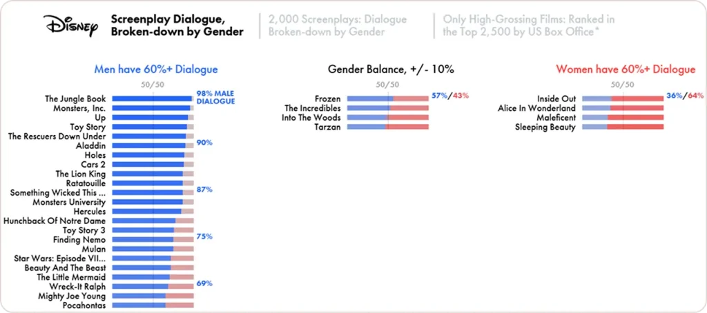
Source: Pudding’s Film Dialogue Analysis
What it shows: Gender representation in film dialogue, broken down by genre, decade, and individual movies.
The Pudding consistently creates some of the best data visualization examples I’ve seen, and their film dialogue project showcases why. They understand something most analysts miss: you need to guide people through discovery, not dump data on their screen.
Their analysis of gender representation in film dialogue uses a scrolling narrative structure. As you scroll, new data layers appear progressively. First, you see overall trends (men speak more in most films). Then, genre breakdowns (action films are the worst offenders). Finally, you can explore individual movies if you’re interested.
This progressive disclosure approach respects the fact that different readers want different levels of information. Casual readers get the headline finding in thirty seconds. Data enthusiasts can drill into specific films and compare dialogue percentages across decades.
The lesson: build journeys through your data, not museums. Museums display everything at once. Journeys reveal insights step by step.
4. Flowing Data’s Life Expectancy Simulator: Making Statistics Personal
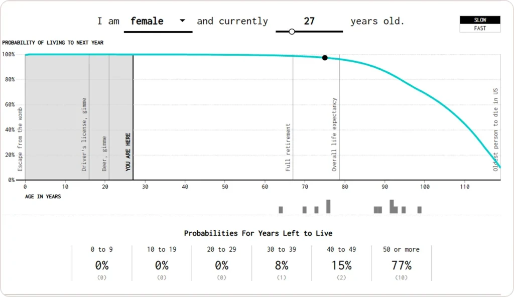
Source: Flowing Data’s Life Expectancy Simulator
What it shows: Your probable lifespan based on demographic factors, visualized as an animated simulation of 100 life paths.
This is one of the most effective creative data visualization examples I’ve encountered because it makes population-level statistics viscerally personal.
You enter your age, gender, and ethnicity. Then you watch 100 animated dots, each representing a potential version of your life, slowly disappear as years pass. Some dots make it to 90 plus. Others don’t. By the end, you see exactly what the statistics mean for someone like you.
The animation is crucial here. Static life expectancy tables are boring and abstract. “72.4 years” means nothing emotionally. Watching those dots disappear one by one creates an emotional response that pure numbers can’t trigger.
The lesson: when you’re working with data about people, find ways to make it personal. Let users see themselves in the data rather than observing it from outside.
5. SmartMoney’s Market Map: Information Density Done Right
Source: SmartMoney’s Market Map
What it shows: 500+ stock performances updated in real-time using a treemap layout where size represents market cap and color represents daily performance.
I use this daily during market hours because it answers my immediate question (what’s happening right now?) without requiring any analysis from me.
The treemap layout is perfect for this use case. Large caps (Apple, Microsoft, Amazon) dominate the visual space proportionally to their market influence. A sea of green tells me it’s a good day; scattered red tiles mean trouble. I can spot sector-wide movements instantly because related stocks are grouped together.
This is what I call “zero-analysis visualization.” The insight is immediate and complete. You don’t need to hover, click, or read labels to understand the market’s direction.
The lesson here changed how I think about decision timescales: for decisions made in seconds (like trading), visualization should communicate instantly. For strategic decisions made over weeks, you can afford more complexity and depth. Match your visualization density to your decision speed.
6. Kieran Healy’s Mortality Rates: When Simple Wins

Source: Kieran Healy’s Mortality Rates
This is my go-to example when clients ask for something “more creative” when they actually need something clearer.
Healy’s visualization of US mortality rates uses a basic line chart with log scale for the y-axis. That’s it. No fancy interactivity. No 3D effects. No animated transitions. Just a clear line showing that mortality rates form a U-shape: high at birth, lowest in childhood, then increasing with age.
The brilliance is in the annotations. Small text labels explain the childhood minimum, the young adult uptick (accidents and violence), and the exponential rise in older ages. These annotations transform a simple chart into a story about the human lifecycle.
The lesson: creativity in data visualization doesn’t mean adding visual complexity. It means finding the clearest possible way to communicate your specific insight. Sometimes that’s a line chart with smart annotations.
7. FiveThirtyEight’s Election Forecasts: Visualizing Uncertainty
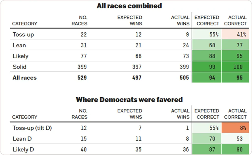
Source: FiveThirtyEight’s Election Forecasts
What it shows: Probability distributions for election outcomes, showing not just who’s likely to win but the range of possible results.
Most election coverage treats polls like facts. FiveThirtyEight’s visualizations treat them like what they actually are: probability distributions with uncertainty.
Their signature approach shows the range of possible outcomes as a distribution. A candidate might be “favored” with 65% probability, but you can clearly see that 35% slice representing scenarios where they lose. This visual representation of uncertainty is more honest than reporting a single predicted outcome.
During the 2020 election cycle, I watched clients finally understand what “70% probability” actually means after seeing these visualizations. Numbers alone don’t convey uncertainty well. Showing the full range of possibilities does.
The lesson: overconfidence kills projects. Good visualization prevents overconfidence by making uncertainty visible and respectable.
This principle of honest data representation, which I explore in depth in my article on the advantages of big data visualization, applies across all industries where forecasting drives decisions.
8. Giorgia Lupi’s Dear Data: Matching Form to Feeling
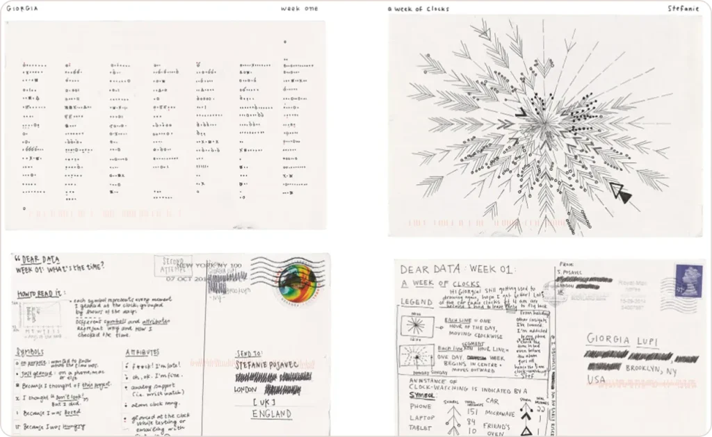
Source: Giorgia Lupi’s Dear Data
What it shows: Personal data (books read, emotions felt, conversations had) hand-drawn using custom visual languages.
Lupi’s “Dear Data” project proved that good data visualization can be beautiful, personal, and informative simultaneously, which contradicted everything I’d learned in business school.
Each hand-drawn postcard visualization uses a custom legend to encode multiple data dimensions into artistic marks. One project tracked every complaint she made in a week, with different symbols for complaint types and colors for emotional intensity.
I’m not suggesting you hand-draw your quarterly reports. But Lupi demonstrates something crucial: the visualization form should match your data’s emotional character. Personal data deserves intimate visualization. Corporate data might need cold precision. Climate data might warrant urgent, visceral design.
The lesson: consider the emotional relationship your audience should have with the data, then make design choices that create that relationship.
9. Google’s COVID-19 Mobility Reports: Context Enables Decisions
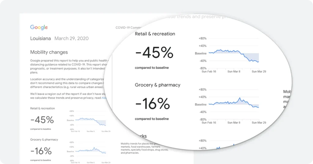
Source: Google’s COVID-19 Mobility Reports
What it shows: Changes in foot traffic to different location categories (retail, parks, workplaces) during pandemic lockdowns.
These reports influenced actual policy decisions worldwide because they made abstract “lockdown effectiveness” concrete and comparable.
The visualization combines small multiple charts (one per category like retail, parks, workplaces) with geographic maps showing regional variation. This dual approach lets readers see both what changed and where it changed. The baseline comparison (percent change from pre-pandemic normal) makes it immediately clear which interventions worked.
The lesson: when your audience includes decision-makers, optimize for comparison and context. “Traffic decreased 45%” is meaningless without context. “45% below pre-pandemic baseline while neighboring regions decreased 60%” enables actual decisions.
This same principle guides effective operational efficiency analytics in healthcare where comparative benchmarks drive improvement.
Numbers without context are just numbers. Numbers with context become insights.
10. ProPublica’s Surgeon Scorecard: High Stakes Demand Clarity
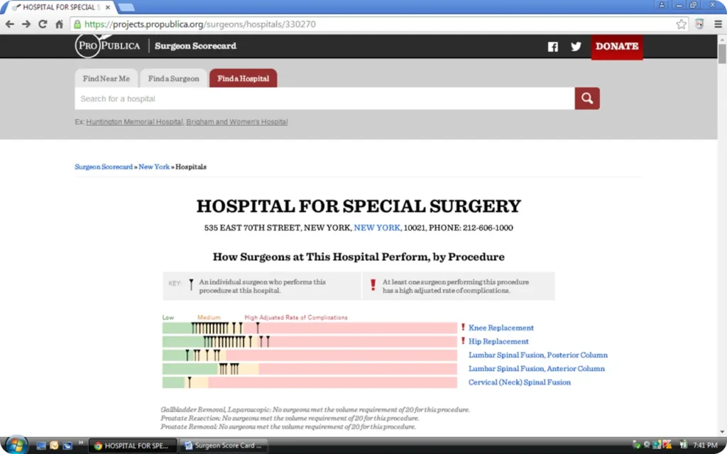
Source: ProPublica’s Surgeon Scorecard
What it shows: Individual surgeon complication and death rates compared to national benchmarks, searchable by surgeon name.
This is the most consequential data visualization example I’ve encountered. It lets patients make informed choices about life-and-death decisions.
The visualization uses simple bar charts showing each surgeon’s complication and death rates versus expected rates adjusted for patient complexity. Color coding (green for better than expected, red for worse) makes the assessment instant. But the full data is there for anyone who wants to dig into case counts and confidence intervals.
The lesson: high-stakes decisions deserve simple, honest visualizations with full transparency. When people’s wellbeing depends on understanding your data correctly, clarity beats cleverness every single time.
The higher the stakes, the simpler the visualization.
How to Apply These Lessons Tomorrow
Start with the decision or insight. What should someone do or understand after seeing your visualization? If you can’t articulate this in one sentence, you’re not ready to design anything yet.
Choose encoding based on data structure. Time series data gets line charts or area charts. Comparisons between categories get bar charts. Spatial data gets maps. Relationships between variables get scatter plots. Part-to-whole relationships get treemaps.
Remove everything that doesn’t serve the insight. For every visual element, ask “what would be lost if I removed this?” If the answer is “nothing,” remove it.
Test with someone unfamiliar with the data. Show your visualization to a colleague who doesn’t know your project. If they can’t tell you the main point in ten seconds, simplify.
Provide depth on demand. Start simple, let interested users dig deeper through interactive filters, expandable sections, or links to full datasets.
I’ve seen terrible visualizations made with expensive enterprise software and brilliant ones made in Excel. The tool matters far less than understanding these core principles.
A well-designed bar chart in PowerPoint beats a confusing interactive dashboard built with premium software every single time. I’ve compared the leading options in my comprehensive guide to top BI tools for 2025.
What Didn’t Work: 3 Failed Visualizations
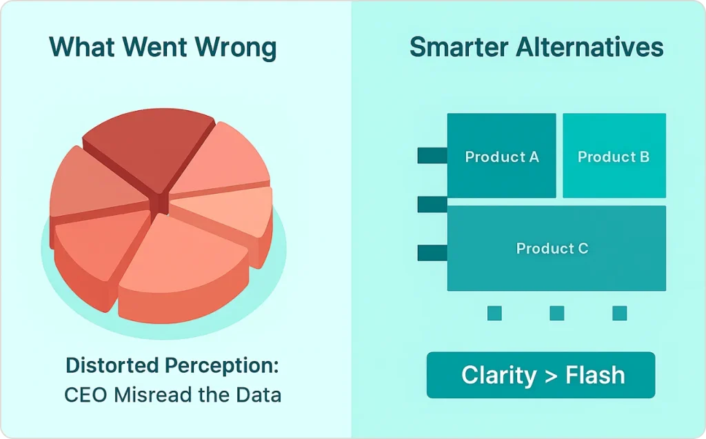
Failed Example 1: The 3D Pie Chart Disaster
I once reviewed a quarterly revenue dashboard where someone had created a 3D pie chart with eight slices, rotated at an angle, with a “shadow” effect. The CEO couldn’t tell which product line was actually performing best because the perspective distortion made the back slices appear smaller than they were.
What to do instead: A simple horizontal bar chart would have shown the ranking instantly. For part-to-whole relationships with many categories, use a treemap or sorted bar chart.
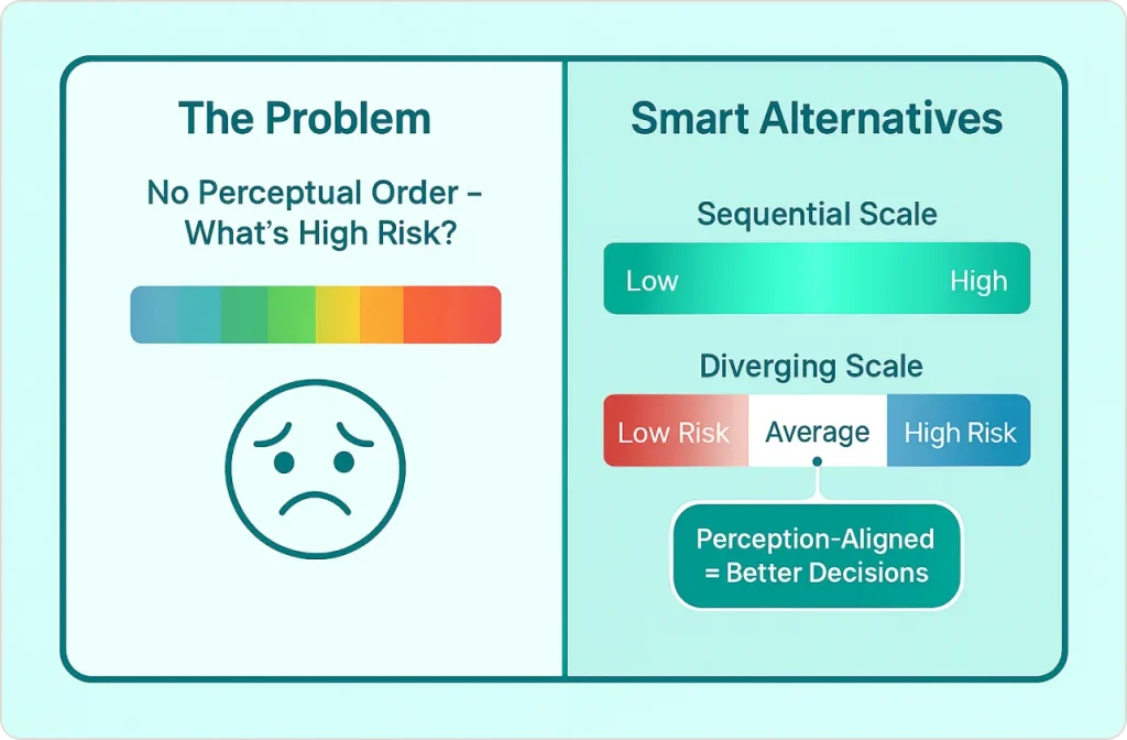
Failed Example 2: The Rainbow Heatmap Problem
A healthcare client showed me a patient risk heatmap using a rainbow color scale to show risk scores from 0 to 100. It looked impressive but was completely unusable because rainbow scales have no perceptual ordering. Is blue a higher risk than green?
What to do instead: Use sequential color scales for continuous data (light to dark of a single hue) or diverging scales for data with a meaningful center point (red-white-blue for above/below average).
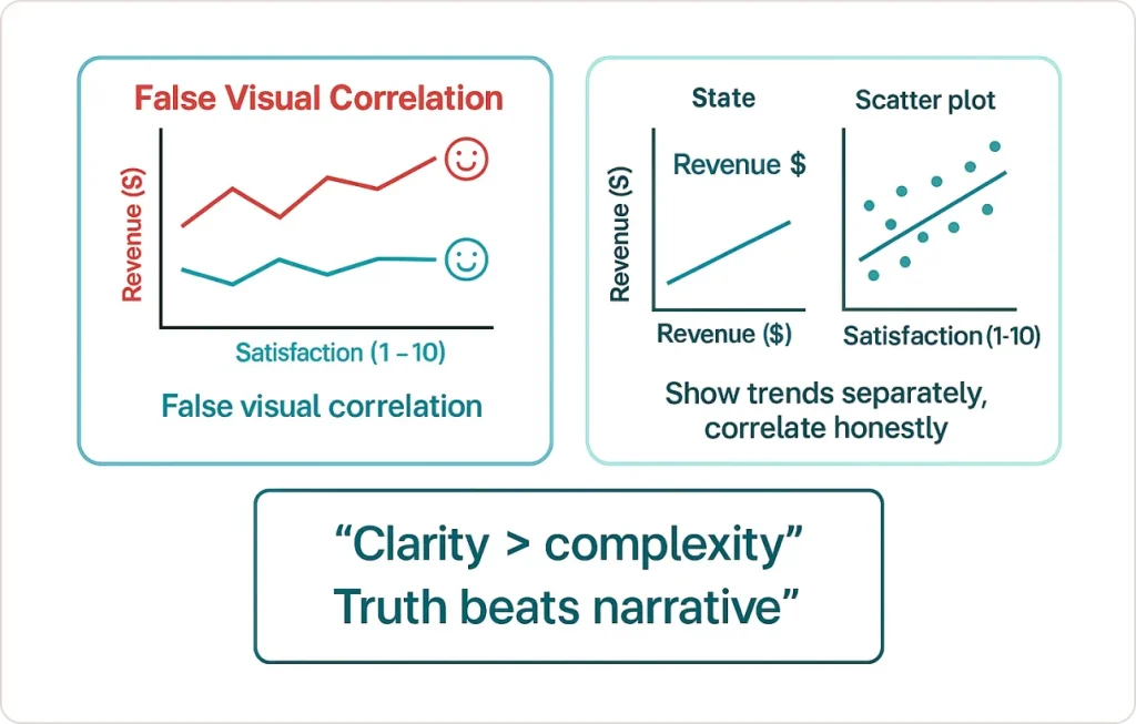
Failed Example 3: The Dual-Axis Deception
I encountered a sales presentation showing revenue and customer satisfaction on the same chart with two different y-axes. The axes were scaled to make both lines trend upward together, creating a false impression that satisfaction and revenue moved in lockstep.
What to do instead: Show the metrics on separate charts positioned vertically so readers can compare trends honestly. If correlation matters, use a scatter plot.
The pattern: All three failures prioritized visual complexity or a desired narrative over clarity and honesty.
For more on matching visualization complexity to user needs, see my breakdown of bad data visualization mistakes to avoid.
What This All Means
The best data visualization examples of 2025 share something fundamental: they respect their audience’s time and intelligence.
They don’t try to impress with technical complexity. They don’t hide limitations or uncertainties. They don’t require extensive training to understand. They simply take complex information and make it clear enough that people can actually use it.
That’s harder than it sounds. It requires you to deeply understand both your data and your audience. You need to make difficult choices about what to show and what to omit. This is where professional data visualization services become invaluable. Experienced teams can identify the signal in your noise and design visualizations that drive actual business outcomes.
But when you get it right, when someone looks at your visualization and immediately understands something they couldn’t grasp before, there’s no better feeling in data work.
The data visualization real-life examples we’ve explored prove that effective visualization isn’t about fancy tools or complex techniques. It’s about clarity, honesty, and purposeful design choices that serve your audience’s needs above everything else.
Whether you’re building dashboards internally or working with data visualization experts to transform your analytics infrastructure, these principles remain constant: immediate clarity, honest representation, purposeful design, and real-world utility.


