
Introduction
I’ll be brutally honest with you: if you’ve ever opened a “dashboard” that looked more like a rainbow explosion than useful business intelligence, you’re in good company. About 90% of the dashboards I see are complete disasters.
When I first started helping companies implement data visualization best practices, I worked with a manufacturing client who had incredible data but absolutely terrible ways of showing it. Their executive team was making million-dollar inventory decisions based on Excel spreadsheets that required a PhD to understand. Sound familiar?
Here’s what shocked me: Harvard Business Review research shows that visual communication has become “a must-have skill for all managers,” because more and more often, it’s the only way to make sense of the work they do, yet Gartner found that 70% of organizations still struggle to effectively use data for decision-making. That’s a massive disconnect.
The reality? Businesses generate 2.5 quintillion bytes of data daily, but without proper data visualization best practices, all that valuable information just becomes expensive noise. I’ve seen companies with amazing data make terrible decisions simply because they couldn’t see what the numbers were actually telling them.
In this comprehensive data visualization guide, I’ll walk you through the exact techniques I use to help companies transform their confusing spreadsheets into powerful decision-making tools. These aren’t theoretical concepts—they’re battle-tested data visualization tips that have helped dozens of businesses turn their data into competitive advantages.
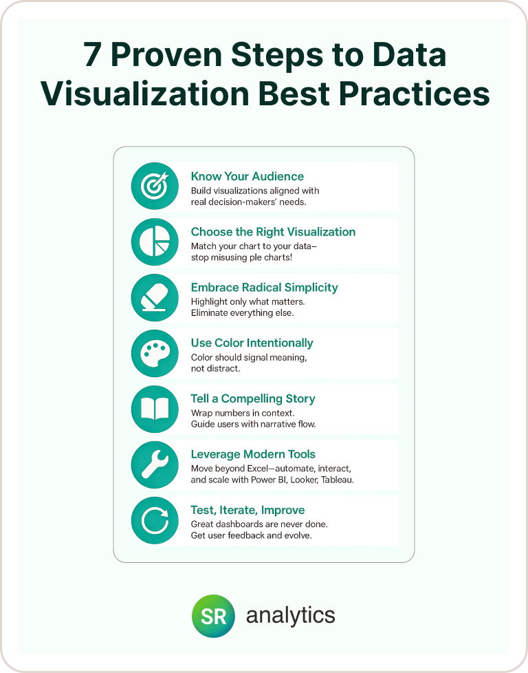
1. Know Your Audience (Or Watch Your Beautiful Charts Fall Completely Flat)
Here’s something that’ll blow your mind: the most stunning visualization in the world is completely worthless if it doesn’t match how your audience actually thinks and makes decisions.
This is the first and most critical step in any data visualization best practices playbook. Before I build any dashboard, I always ask my clients this simple question: “Who’s actually going to use this thing, and what decisions do they need to make with it?” You’d be shocked how often this question completely stumps smart business leaders.
When we worked with Pinnacle Fund Services, we had to design completely different dashboards for fund managers, investors, and securities teams—all looking at the same underlying data! The fund managers needed high-level portfolio performance trends, investors wanted detailed ROI breakdowns, and the securities team required real-time compliance monitoring. Same data, totally different needs, completely different data visualization techniques required.
Here’s what I’ve learned after building hundreds of dashboards: A marketing VP needs to see campaign ROI trends at a glance, while a digital marketing specialist needs granular click-through rates by channel, time period, and audience segment. The wrong data visualization technique for the wrong audience equals zero business value.
Your Audience Analysis Framework (That Actually Works)
- Executive Leadership: These folks want the “so what” immediately. Focus on strategic KPIs, trends, and outcomes that impact quarterly goals. Think big picture, not nitty-gritty details. Your data visualization technique should emphasize trends and comparisons over raw numbers.
- Middle Management: These are your operational heroes. They need metrics with drill-down capabilities to spot problems quickly. They’re managing teams and need data visualization tips that help them coach performance and identify bottlenecks.
- Analysts: Give them the full data exploration toolkit. They want detailed capabilities, multiple filtering options, and the ability to slice data every possible way. This audience appreciates advanced data visualization techniques and interactive features.
- External Stakeholders: Context is everything here. Include benchmarks, industry comparisons, and clear narrative flow. Your data visualization guide should emphasize storytelling over exploration for this group.
Pro tip: I always start visualization projects with a 10-minute stakeholder interview. Understanding their typical day, decision timeline, and biggest data frustrations saves me hours of revision later. This is one of the most important data visualization best practices I can share.
2. Choose the Right Data Visualization Technique (Stop Using Pie Charts for Everything!)
I can’t tell you how many times I’ve seen companies make costly strategic mistakes because they forced their data into the wrong chart type. This is where most data visualization best practices fall apart—people think all charts are created equal. They’re not.
The wrong data visualization technique can literally lead to wrong business conclusions. I once worked with a retail client who was using pie charts to compare 12 different product categories. They couldn’t tell which products were actually performing well because pie charts make precise comparisons nearly impossible. We switched to a simple horizontal bar chart, and suddenly they could see their top performers clearly—leading to a complete inventory strategy overhaul that increased profits by 18%.
This is why choosing the right data visualization technique is so critical. Forrester research confirms that “visual information is more powerful than any other type of sensory input,” but this only works when you match the visualization to your data and message.
The Complete Data Visualization Technique Selection Guide
Line Charts: Your go-to data visualization technique for trends over time
- Perfect for: Monthly revenue tracking, website traffic patterns, customer acquisition trends
- Data visualization tips: Use these when you need to show change over continuous periods
- Red flag: Don’t use line charts for categorical comparisons or one-time data points
Bar and Column Charts: The workhorses of data comparison
- Perfect for: Sales by region, product performance, budget allocations
- Essential data visualization tips: Keep categories to 7 or fewer for easy mental processing
- Why they work: Humans are naturally good at comparing lengths and heights
Scatter Plots: The correlation detective data visualization technique
- Perfect for: Customer lifetime value vs. acquisition cost, ad spend vs. conversions
- Data visualization guide: Always include trend lines when relationships are clear
- Pro insight: Great for identifying outliers and clusters in your data
Heat Maps: Pattern recognition across two dimensions
- Perfect for: Geographic sales performance, website click patterns, time-based activity
- Critical data visualization tips: Use consistent color scales to avoid misleading interpretations
- Best practice: Include legends that clearly explain what colors represent
Geographic Maps: Location-based insights made visual
- Perfect for: Regional sales analysis, demographic studies, supply chain optimization
- Watch out for: Population density bias—high numbers in dense areas might not mean better performance
Data Visualization Techniques to Avoid (Seriously, Just Don’t)
Pie Charts: Only use these for 5 or fewer categories where proportions matter more than precise values. For 99% of business applications, horizontal bar charts communicate information better. This is one of the most important data visualization best practices to remember.
3D Charts: They look fancy in PowerPoint, but they distort perception and make accurate comparison impossible. Skip the eye candy.
Dual-Axis Charts: Use sparingly and only when scales have logical relationships. Otherwise, you’re creating misleading correlations that can lead to bad decisions.
3. Embrace Radical Simplicity (Or Watch Your Users Give Up Completely)
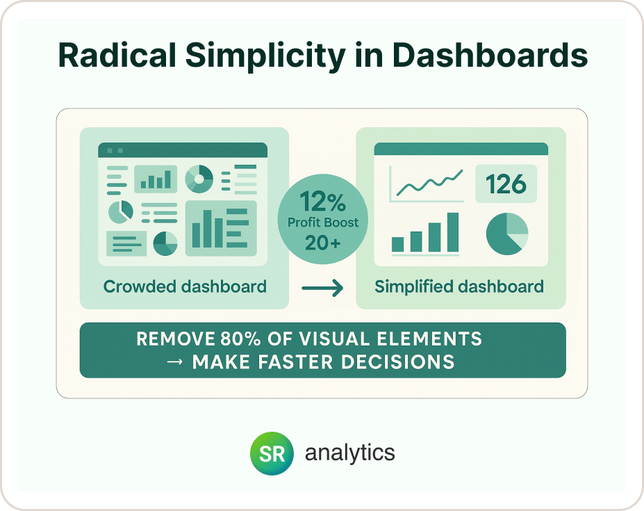
Let me share something that might sting a little: if everything on your dashboard is highlighted, nothing is highlighted. I learned this lesson the hard way when I first started implementing data visualization best practices.
At Lifepro Fitness, we achieved a 12% boost in profitability and saved over 20 hours weekly by automating data processes—but the real game-changer was simplifying their dashboards to focus only on metrics that directly impacted their bottom line. We removed 80% of the visual elements, and suddenly their team could make decisions in minutes instead of hours.
This is probably the most counterintuitive of all data visualization best practices: less is more. Way more.
Here’s my golden rule for effective data visualization: Every single element on your visualization should either help users understand the data or guide them toward action. Everything else is just expensive clutter that slows down decision-making.
White Space: Your Secret Data Visualization Weapon
McKinsey’s latest research on data visualization best practices shows that the most effective charts guide viewers’ attention through strategic use of white space and visual hierarchy. Here’s how to implement this data visualization technique:
- Top-left corner positioning: Put your most critical metric here—that’s where eyes naturally go first
- Strategic grouping: Use white space to group related metrics together
- The 5-7 rule: One of the most important data visualization tips—limit dashboards to 5-7 key metrics per screen maximum
- Clear visual separation: Create obvious breaks between different data categories
From my experience implementing data visualization best practices across dozens of companies, cleaner dashboards consistently drive faster decision-making. It’s not about being minimalist for aesthetics—it’s about being purposeful for performance.
4. Use Color Like a Communication Pro (Not Like You’re Decorating a Birthday Cake)
Color isn’t decoration in effective data visualization—it’s communication. The right color strategy can instantly show performance status, urgency, and relationships without requiring users to read a single label.
This is one of the most overlooked data visualization best practices. Harvard Business Review’s research on visual perception confirms that effective visualizations “cut through the noise and connect with your target audience” through strategic use of design elements. But here’s what most people get wrong: they think more colors equal more information. Wrong. More colors equal more confusion.
I once worked with a financial services client whose dashboard looked like a rainbow had exploded across their screens. They were using 12 different colors to represent various data points, and their team spent more time trying to decode the color scheme than actually analyzing the data. We simplified to a 4-color system, and their decision-making speed improved by 40%.
Your Strategic Color Playbook for Data Visualization
Green: Performance above target, positive trends, “go” actions—this is universal business language
Red: Below threshold, negative trends, urgent attention required—but use sparingly to maintain impact
Blue: Neutral information, primary data series, stable metrics—your reliable workhorse color
Yellow/Orange: Caution zones, moderate concern, transitional states—perfect for “watch this” situations
Here’s one of my most important data visualization tips: Choose colors that carry intuitive meaning in your industry. Healthcare dashboards might use different color associations than financial services or manufacturing. Don’t fight against what people already expect—work with their existing mental models.
Make Your Data Visualization Accessible (Because Excluding People Is Bad Business)
These accessibility-focused data visualization best practices aren’t just nice to have—they’re essential:
- Check contrast ratios: Use tools like WebAIM’s contrast checker to verify readability—if people can’t see it clearly, your data visualization technique fails
- Avoid red-green combinations: About 8% of men have red-green color blindness, so don’t make your insights invisible to a significant portion of your audience
- Add patterns or textures: Use shapes, textures, or icons as backup cues beyond color
- Test with diverse users: Include team members with visual impairments in your testing—it makes data visualization better for everyone
Advanced Data Visualization Techniques That Actually Work
- Size indicates importance: Make critical metrics larger and secondary data smaller—simple but incredibly effective
- Position shows priority: Prime screen real estate goes to your most important insights—this is basic data visualization guide principle
- Consistency builds trust: Use the same color for the same metric across all dashboards—don’t make people relearn your system
- Subtle animation draws attention: Gentle motion can highlight changing values without being annoying—but use this data visualization technique sparingly
- Non-negotiable rule: Never sacrifice readability for visual appeal. The prettiest dashboard is worthless if users can’t quickly extract actionable insights.
5. Tell a Compelling Story (Because Data Without Context Is Just Random Numbers)
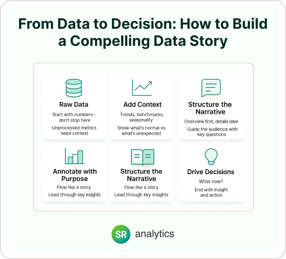
Data without context is like a movie with no plot—technically there’s content, but nobody knows what’s happening or why they should care. This is where storytelling becomes one of the most powerful data visualization best practices.
McKinsey’s visualization experts create compelling narratives by structuring charts to “tell a story about our changing world” through careful attention to layout, annotations, and contextual information. They don’t just show data—they explain what it means and why it matters.
Let me give you a real example of storytelling in data visualization: One of our retail clients was panicking about “declining sales.” But when we applied proper data visualization techniques and added context layers—seasonal trends, competitor launches, and economic indicators—we revealed that their “decline” was actually outperforming the market during a difficult period. Context transformed panic into confidence and smart strategic decisions.
Essential Storytelling Elements for Effective Data Visualization
- Clear, descriptive titles: This is one of the most important data visualization tips. Instead of “Q3 Results,” use “Q3 Sales Exceed Target by 15%, Driven by Enterprise Segment Growth”—tell people exactly what to think.
- Meaningful baselines: Include prior year, budget, or industry benchmarks so people immediately know if numbers are good or bad. This context makes your data visualization technique much more powerful.
- Strategic annotations: Add brief explanations for unusual spikes, dips, or patterns—don’t make people guess what caused changes.
- Logical narrative flow: Arrange visualizations to answer questions in sequence: overview first, then details. This follows basic data visualization guide principles for cognitive processing.
Here’s what I’ve learned about data visualization best practices: The most effective data stories answer three critical questions: What happened? Why did it happen? What should we do about it? If your dashboard doesn’t answer all three, you’re only doing part of your job.
6. Leverage Modern Tools (Stop Torturing Yourself With Excel)
Let’s be completely honest: trying to create effective data visualization using only Excel is like trying to paint the Mona Lisa with crayons. Technically possible, but why would you torture yourself when better tools exist?
This is where modern data visualization best practices really shine. Gartner’s 2024 research shows that leading analytics platforms now incorporate machine learning to automatically generate insights, data storytelling modules, and natural language query capabilities. The tools have gotten incredibly powerful, and they’re not just for data scientists anymore.
I remember working with a client who was spending 15 hours every week manually updating Excel charts for their executive dashboard. We implemented a modern BI solution, and now those same insights update automatically. That’s 15 hours per week they can spend on actually analyzing data instead of wrestling with spreadsheets.
Platform Selection Strategy (Without the Marketing Fluff)
- Microsoft Power BI: Perfect if you’re already living in the Microsoft ecosystem. Great integration with Office 365 and Azure, plus your IT team probably already knows how to support it. Excellent for standard data visualization techniques and business reporting.
- Tableau: The gold standard for advanced data visualization capabilities. Extensive customization options and a huge community sharing data visualization tips and best practices. Best choice if you need sophisticated data visualization techniques.
- Qlik Sense: Their associative data model lets users explore data intuitively. Strong self-service capabilities without requiring advanced technical skills. Great for organizations wanting to democratize data visualization.
- Looker/Google Cloud: Native cloud integration and powerful data modeling. Perfect if you’re all-in on Google’s ecosystem and need scalable data visualization solutions.
- Here’s my platform selection rule: Choose tools that connect easily to your existing data sources and match your team’s technical expertise. The best platform for data visualization best practices is the one your users will actually adopt—not the one that looks coolest in demos.
Interactive Features That Drive Real User Adoption
- Drill-down capabilities: Let users move from summary to detail views without clicking through seventeen different screens. This data visualization technique keeps users engaged and exploring.
- Dynamic filtering: Enable date ranges, department views, or product category selections that actually work smoothly. Poor filtering ruins the entire data visualization experience.
- Contextual tooltips: Provide additional information on hover without cluttering the main view. This is one of the most useful data visualization tips for information density.
- Export functionality: Let users download data or images for presentations—because sometimes people still need PowerPoint, and fighting this reality is pointless.
In our work with Pinnacle Fund Services, we delivered over 15 detailed reports with interactive dashboards that enabled stakeholders to analyze fund performance, asset allocation, and investor metrics on demand. The key was building self-service capabilities that reduced their dependency on IT support tickets while maintaining data visualization best practices.
7. Test, Iterate, and Keep Improving Your Data Visualization
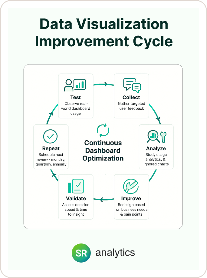
Here’s something that might surprise you: the best data visualizations are never “finished.” They evolve constantly based on user feedback, changing business needs, and new insights about what actually drives decisions.
This ongoing improvement cycle is one of the most critical data visualization best practices that organizations often overlook. Forrester research emphasizes that “data visualization best practices go beyond technology and involve disciplines like the psychology of visual perception and graphical design.” You’re not just picking chart types—you’re designing decision-making tools.
I learned this lesson working with a logistics company. Their initial dashboard looked great in our design meetings, but when we watched real users trying to complete actual tasks, we discovered three major usability problems within the first week. The data visualization techniques that looked perfect in theory didn’t match how people actually work.
User Testing Framework (That Won’t Consume Your Life)
- Conduct brief usability sessions: Watch team members use dashboards for real tasks—you’ll be amazed at what you discover about your data visualization techniques in practice.
- Track usage analytics: Identify which charts get ignored and which drive action. Data about your data visualization is incredibly valuable for improvements.
- Gather specific feedback: Ask “What questions can’t you answer?” rather than “How do you like it?”—you’ll get much more useful responses for refining your data visualization.
- Monitor decision outcomes: Actually measure whether your data visualization best practices improve business results, not just whether people say they like the charts.
Here’s my favorite testing question: “If you had 30 seconds to prepare for a meeting using this dashboard, what would you focus on?” The answer reveals whether your data visualization technique priorities match actual user needs.
Continuous Improvement Process That Actually Happens
- Monthly reviews: Regular check-ins with power users to identify pain points before they become major problems with your data visualization.
- Quarterly redesigns: Update visualizations based on changing business priorities—your Q1 data visualization might not work for Q4 decision-making needs.
- Annual audits: Comprehensive review of data sources, metrics relevance, and technical performance of your data visualization best practices.
- Simple feedback loops: Make it incredibly easy for users to suggest improvements or report issues—preferably with one click from within your data visualization.
Don’t Forget Accessibility in Your Data Visualization Best Practices
- Screen reader compatibility: Ensure charts work with assistive technologies—this expands your data visualization audience
- Mobile responsiveness: Test dashboards on phones and tablets—more people view data visualization on mobile than you might think
- Cognitive load assessment: Verify that visualizations don’t overwhelm users with information overload
- Cultural considerations: Be mindful of color meanings and design conventions across different user groups in your data visualization
Non-negotiable principle: Build feedback collection directly into your data visualization platform. Users will tell you what works if you make sharing insights easy and painless.
Performance Metrics That Actually Matter for Data Visualization
Track these key indicators to measure whether your data visualization best practices are delivering real value:
- Time to insight: How quickly can users find answers to common questions using your data visualization?
- Decision speed: Are business decisions happening faster with improved data visualization techniques?
- Data adoption: Is more of your organization actually using data for decision-making?
- User satisfaction: Regular surveys on dashboard usefulness—but keep them short and actionable


