
TL;DR:
1. Define the decision you need to make
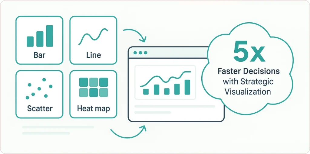
2. Match question type to chart type:
- Comparison → Bar chart
- Trend → Line graph
- Correlation → Scatter plot
- Distribution → Histogram
- Multi-dimensional → Heat map
3. Design for clarity (remove decoration, add context)
4. Ensure accessibility (4.5:1 contrast, redundant encoding)
5. Measure impact (decision speed, engagement, outcomes)
Real Results: Vanguard (32% ↑), Deutsche Bank (89% trust), McKinsey clients (22% ↑ ROI)
Tools: Power BI (Microsoft integration), Tableau (visual quality), Python (flexibility), Excel (quick work)
One Critical Question: “What decision does this enable?” Ask before building anything.
Why Your Data Visualizations Aren’t Driving Decisions
Your executive team asks “So what should we do?” after every dashboard presentation. That’s the symptom of a deeper problem: most visualizations describe what happened without prescribing what to do next.
The root cause isn’t your data or your tools. It’s choosing charts without first defining the decision you need to enable. A bar chart comparing 15 product lines doesn’t answer “Which three products should we discontinue?” A line graph showing declining revenue doesn’t prescribe “Where do we reallocate the budget?”
Research from Bain & Company shows organizations using decision-driven visualization make choices 5× faster and execute 3× more effectively than competitors relying on descriptive dashboards alone. The difference isn’t more data—it’s matching the right visualization technique to the business question.
In this guide:
- Chart selection framework matching 8 visualization types to business questions
- Real ROI case studies: Vanguard’s 32% conversion lift, Deutsche Bank’s 89% trust rating
- Advanced techniques for multi-dimensional data analysis
- Tool comparison: Power BI vs Tableau vs Python vs Excel
- Accessibility and ethical design standards that build stakeholder trust
Quick Answer:
Data visualization techniques transform raw data into charts, graphs, and dashboards that reveal patterns and enable faster decisions. Choose bar charts for comparisons, line graphs for trends, scatter plots for relationships, and heat maps for multi-dimensional analysis. Research from Bain & Company shows companies using strategic visualization make decisions 5× faster than those relying on spreadsheets alone.
What Are Data Visualization Techniques?
Data visualization techniques are systematic methods for representing information visually through charts, graphs, maps, and interactive dashboards to make patterns, outliers, and relationships immediately apparent.
The importance of data visualization cannot be overstated in today’s data-driven business environment. Presentations with visual data convince 67% of audiences versus 50% with verbal content alone, according to Wharton School research. Visual information is retained at 65% compared to just 10% for text-based data.
But here’s the problem most organizations face: they’re drowning in charts but starving for insights. The average executive sees 15+ dashboards weekly, yet struggles to identify which metric actually requires action today.
The solution isn’t more visualizations. It’s matching the right visualization techniques to the specific business question you’re trying to answer.
How to Choose the Right Visualization: Start With Your Question
For Comparing Categories: Bar Charts and Bullet Graphs
When to use: Comparing quantities across distinct categories like sales by region, product performance, or campaign results.
Bar charts remain the workhorse of business reporting for good reason. They make comparisons instantly clear. Horizontal bars work better than vertical columns when you have 7+ categories or long labels, because they provide more space for readable text.
Example: A retail analytics team comparing Q4 sales across 12 product categories would use a horizontal bar chart, sorted from highest to lowest revenue. The instant takeaway: which categories drove growth and which underperformed.
For performance against targets, bullet graphs offer a superior alternative to traditional dashboard gauges. According to Harvard Business School research on data visualization techniques, bullet graphs display actual performance, comparative benchmarks, and qualitative ranges (poor/fair/good) in a single compact visual. This eliminates the wasted space of circular gauges while providing more context.
When building these visualizations, Power BI’s robust visualization engine enables rapid development of bullet graphs with conditional formatting that automatically highlights performance against targets.
For Tracking Change Over Time: Line Graphs
When to use: Showing trends across continuous time periods like monthly revenue, quarterly growth rates, or daily website traffic.
Line graphs excel at revealing patterns: seasonal cycles, growth trajectories, sudden changes. These patterns remain invisible in spreadsheets. The continuous line emphasizes the flow of time and helps viewers mentally extrapolate future trends.
Example: An SEO team tracking organic traffic growth over 18 months would use a line graph. Adding a second line for paid traffic creates an immediate visual comparison of acquisition channel performance.
The key principle from data visualization research published by Gartner: use line graphs for continuous data over time, not for discrete categorical comparisons (that’s what bar charts are for).
For Revealing Relationships: Scatter Plots
When to use: Examining potential correlation between two continuous variables like marketing spend versus sales, experience versus salary, or price versus customer satisfaction.
Scatter plots are essential for correlation analysis because each point represents one observation, making outliers and clusters immediately visible.
Example: A SaaS company plots customer acquisition cost (CAC) on the X-axis and lifetime value (LTV) on the Y-axis for 200 customers. The scatter plot reveals three distinct clusters: high-value enterprise clients, mid-tier SMB customers, and low-value churners. This single visualization reshapes their entire sales targeting strategy.
For Understanding Distributions: Histograms
When to use: Showing how values are distributed across ranges like age demographics, response times, or test scores.
Histograms group continuous data into bins and display frequency counts, making it easy to spot whether data is normally distributed, skewed, or multi-modal (having multiple peaks).
Example: A hospital analyzes emergency department wait times using a histogram with 10-minute bins. The distribution shows two distinct peaks: one at 15 minutes (routine cases) and another at 90 minutes (complex cases). This bimodal pattern reveals that staffing models should differentiate between case types, not treat all patients identically.
For Showing Composition: Pie Charts and Waterfall Charts
When to use pie charts: Displaying simple proportions of a whole, ideally with 3-5 segments maximum.
Pie charts get a bad reputation, mostly because they’re overused. The research is clear from Evalacademy data visualization guidelines: human eyes struggle to compare angles and areas, making pie charts less precise than bar charts for detailed comparisons.
Best practice: Reserve pie charts for high-level budget breakdowns or market share when approximate proportion matters more than precision.
When to use waterfall charts: Showing how an initial value is affected by a series of positive and negative changes to reach a final value.
Waterfall charts are indispensable for revenue bridges (starting revenue + new sales – churn = ending revenue), budget variance analysis, or inventory flow.
Example: A CFO presents a waterfall chart showing how a $10M budget became $8.7M actual spend: +$2M additional marketing investment, -$1.5M deferred IT projects, -$1.8M cost savings from vendor renegotiation.
Professional data visualization consulting services can help you design executive-ready waterfall visualizations that transform how your finance team communicates budget performance to stakeholders.
Advanced Multi-Dimensional Visualization Techniques
Basic charts handle two dimensions effectively. But modern business questions require analyzing 5, 10, or 20 variables simultaneously. That’s where advanced techniques of data visualization become essential, often requiring data visualization programming skills.
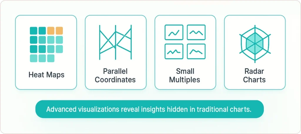
Heat Maps: Color-Coded Density Visualization
Heat maps use color intensity to represent values in a matrix, making them highly effective for correlation matrices, geographic density, or time-based patterns.
Application 1: Correlation Analysis A correlation matrix heat map displays 30 variables with color-coded cells showing correlation coefficients. Dark red indicates strong positive correlation, dark blue shows strong negative correlation, and white represents no correlation. In seconds, analysts identify which variables move together. These relationships would take hours to discover in spreadsheets.
Application 2: Geographic Patterns A retail expansion team uses a geographic heat map showing customer density by ZIP code. Hot spots (red/orange) indicate high-opportunity areas for new locations, while cool spots (blue) suggest oversaturated markets.
Parallel Coordinates Plots: Comparing Multiple Dimensions
Parallel coordinate plots represent each variable as a vertical axis, with individual observations displayed as lines crossing these axes. They’re particularly useful when comparing 4-10 dimensions simultaneously.
Example: A manufacturing quality team compares products across six specifications: cost, weight, durability score, customer rating, return rate, and profit margin. Each product appears as a colored line crossing all six axes. Clusters of lines reveal product families with similar profiles, while outlier lines identify products that don’t fit standard patterns.
The technique comes from multivariate analysis research and is especially powerful for identifying trade-offs, like products with high customer ratings but low profit margins.
Small Multiples: Maintaining Context Across Categories
Small multiples (also called trellis plots or faceting) involve creating a series of similar charts using identical scales and axes, allowing easy comparison across categories or time periods.
Example: A CPG brand needs to compare sales trends for 12 product categories across 8 geographic regions (96 potential chart combinations). Rather than one cluttered chart with 96 lines, small multiples create a 12×8 grid of tiny line charts. Each shows one product-region combination with consistent axes. Patterns jump out: “Why is Category X declining only in the Southeast?” or “Why does Category Y spike in Q4 across all regions?”
Organizations implementing business intelligence consulting services often discover that small multiples dramatically improve executive understanding of complex multi-dimensional patterns compared to traditional single-chart approaches.
Radar Charts: Multi-Dimensional Comparisons
Radar charts (also called spider charts) display multivariate data on radial axes emanating from a central point, making them effective for comparing multiple variables across different entities.
Example: An HR team compares five job candidates across six competencies: technical skills, communication, leadership, problem-solving, cultural fit, and experience. Each candidate’s profile forms a unique shape on the radar chart. The ideal candidate’s shape closely matches the target profile overlay, making the best fit visually obvious.
Best practice: Limit radar charts to 3-6 variables and 2-4 entities for clarity. Beyond that, consider parallel coordinates or a comparison table instead.
💡Learn how to avoid common data visualization pitfalls to ensure your charts drive clear, confident decisions — explore our guide on bad data visualization examples.
Measuring Visualization ROI: Real Business Impact
Case Study: Vanguard’s 32% Conversion Increase
Vanguard, the investment management company, implemented animated time-series visualizations in their retirement planning tools. Instead of static charts showing final projected balances, clients could watch their savings grow year-by-year under different contribution scenarios. (Source)
The result: A 32% spike in client subscriptions for long-term savings plans, according to their Q1 2024 investor report. The dynamic visualization made abstract long-term planning tangible and emotionally compelling.
Case Study: Deutsche Bank’s Trust Rating Jump
Deutsche Bank overhauled ESG reporting by replacing dense PDF reports with concise Power BI dashboards for monthly board presentations. The new format used small multiples to compare performance across divisions and color-coded KPIs to highlight areas requiring attention. (Source)
Result: 89% of board members rated the new visual format as “highly trustworthy” compared to 54% for previous formats, according to their transparency initiative findings. Higher trust meant faster approval cycles and fewer questions about data methodology.
Case Study: McKinsey’s 22% Expansion Planning ROI
McKinsey research documented how spatial visualizations (combining demographic heat maps, competitor location mapping, and customer density overlays) improved retail expansion decisions. Companies using these multi-layer geographic visualizations achieved 22% higher ROI on new location investments compared to those using traditional spreadsheet analysis. (Source)
The key insight: Seeing patterns spatially activates different cognitive processing than reading tabular data, leading to better strategic intuition.
Similar results are achievable through comprehensive data analytics services that combine advanced visualization with predictive modeling to support strategic decision-making.
Avoiding Misleading Visualizations: Accuracy and Trust
Poorly designed visualizations don’t just confuse. They actively mislead and erode trust. Research from the University of Utah’s Visualization Design Lab found that missing contextual information causes misleading interpretations in up to 84% of cases.
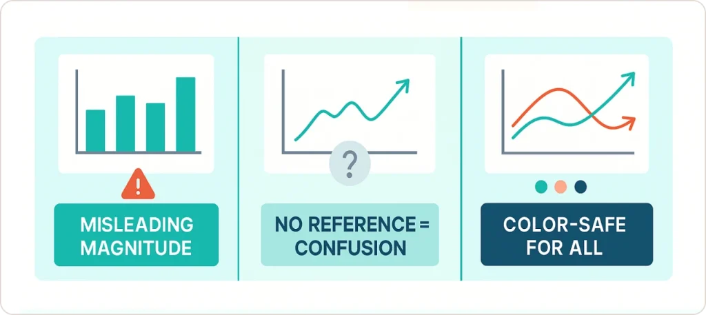
The Truncated Y-Axis Problem
The most common “chart crime” is starting the Y-axis at a value other than zero to exaggerate small differences.
Example: A company shows Q1 revenue of $95M and Q2 revenue of $100M. Starting the Y-axis at $90M makes the bar for Q2 appear twice as tall as Q1, visually suggesting 100% growth when actual growth was 5.3%.
Fix: For bar charts and column charts, always start the Y-axis at zero. For line charts showing subtle changes (like stock prices or temperature variations), non-zero baselines are acceptable if clearly labeled and appropriate to the data range.
The Missing Context Problem
A highly publicized example involved COVID-19 case comparisons between Iceland and Nigeria. A viral chart showed Iceland (highly vaccinated) had higher case numbers than Nigeria, leading to false conclusions about vaccine effectiveness.
The critical missing context: Iceland had a testing rate approximately 200 times higher than Nigeria at the time. Higher case detection doesn’t indicate higher actual prevalence. It indicates better testing infrastructure.
Fix: Always include methodology notes, data sources, collection timeframes, and known limitations. Transparency builds trust.
Color Accessibility Requirements
Approximately 8% of men and 0.5% of women have some form of color vision deficiency. Relying on color alone to convey information (like red for negative, green for positive) excludes these users and violates WCAG accessibility standards.
Fix: Use redundant encoding. If red indicates “below target,” also add a downward arrow (↓) or minus symbol (-). If green indicates “above target,” add an upward arrow (↑) or plus symbol (+).
Provides a comprehensive overview of essential data visualization techniques, from bar charts to interactive dashboards, empowering you to communicate complex data effectively. Learn design principles and tool recommendations to create impactful, engaging visual stories that drive informed decisions.
Tools for Building Effective Visualizations
Business Intelligence Platforms: Power BI vs Tableau
Power BI integrates seamlessly with Microsoft ecosystems (Excel, SQL Server, Azure, SharePoint), making it ideal for organizations already using Microsoft infrastructure. Organizations report 70% reduction in report generation time when migrating from Excel-based reporting to Power BI dashboards.
Tableau excels in visual elegance and advanced statistical visualization. It’s particularly strong for public-facing dashboards and data storytelling. The learning curve is steeper than Power BI, but output quality is consistently rated higher for presentation contexts.
Programming Languages for Custom Visualization
For maximum flexibility and statistical rigor, data visualization programming environments are essential:
Python (using Matplotlib, Seaborn, and Plotly libraries) is ideal for integrating visualizations into machine learning workflows, web applications, and automated reporting systems. Plotly creates interactive HTML visualizations that embed easily in web dashboards.
R (particularly with the ggplot2 library) remains the gold standard for statistical graphics and academic research. The “grammar of graphics” approach in ggplot2 provides unmatched control over every visual element, making it preferred for publication-quality charts.
JavaScript (D3.js library) offers unlimited customization for web-based visualizations. Major news organizations like The New York Times and The Washington Post use D3.js for interactive data journalism. The trade-off: steep learning curve requiring significant JavaScript expertise.
Organizations building custom analytics applications often leverage data engineering services to create robust data pipelines that feed Python or R-based visualization systems with clean, real-time data.
Excel: Still Relevant for Quick Analysis
Microsoft Excel remains highly accessible for basic chart generation, pivot table analysis, and fundamental financial reporting. It’s excellent for quick exploratory analysis and ad-hoc reporting.
Limitations: Excel struggles with real-time data connections, advanced interactivity, multi-source data integration, and visualizations beyond standard chart types. For enterprise-scale reporting with live dashboards and drill-down capabilities, dedicated BI tools deliver significantly better results.
Understanding when to migrate from Excel to Power BI depends on factors like data volume, refresh frequency requirements, collaboration needs, and the complexity of analysis required.
Future Trends: AI-Driven Visualization and Real-Time Streaming
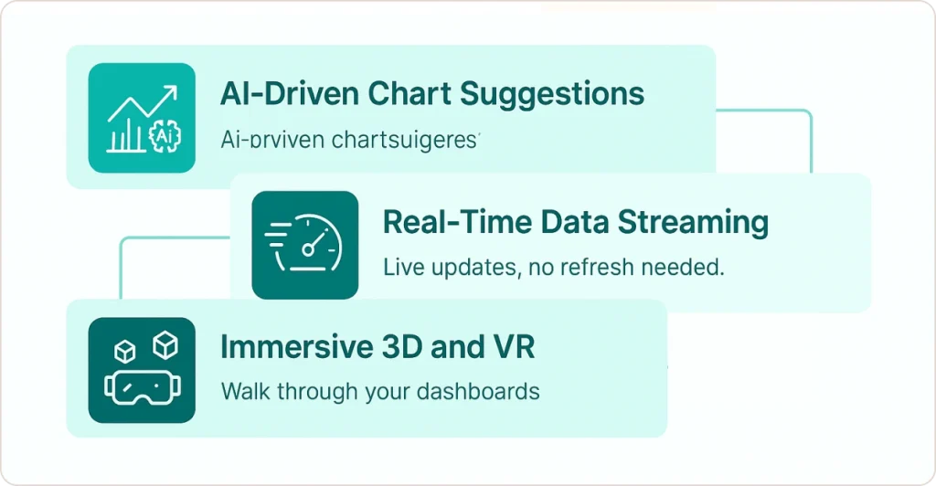
AI-Driven Chart Suggestions
Modern BI platforms increasingly use artificial intelligence to analyze raw datasets and suggest optimal visualization types. Power BI’s “Quick Insights” and Tableau’s “Ask Data” features use natural language processing to generate visualizations from plain English queries like “show me sales trends by region over the last 12 months.”
Organizations exploring AI data visualization tools report 73% faster insight discovery and significant reductions in manual chart creation time.
Real-Time Data Streaming
Organizations are prioritizing systems capable of continuous, real-time monitoring, particularly in financial services (trading volumes, fraud detection), manufacturing (production line efficiency), and logistics (shipment tracking, inventory levels).
Modern BI tools leverage API connections and database triggers to refresh dashboards every 30-60 seconds, enabling decision-making based on current rather than historical data.
Immersive 3D and VR Experiences
While still emerging, virtual reality data visualization is finding practical applications in:
- Healthcare: 3D anatomical visualizations for surgical planning
- Logistics: Virtual warehouse layouts with real-time inventory heat maps overlaid on 3D facility models
- Manufacturing: Immersive facility simulations showing production flow bottlenecks
💬 Industry Expert Perspective
“The purpose of visualization is insight, not pictures.” – Ben Shneiderman, Distinguished University Professor Emeritus, University of Maryland
Conclusion: From Data Overload to Decision Clarity
The competitive advantage comes from matching the right data visualization techniques to the specific question you’re trying to answer, then designing for clarity, accuracy, and accessibility.
Key principles to remember:
- Match technique to question. Start by defining the business decision you’re enabling, then select the chart type that answers that specific question most clearly.
- Prioritize clarity over decoration. Remove all non-essential visual elements. Maximize the “data-ink ratio”: the proportion of ink devoted to displaying actual data versus decorative elements.
- Design for accessibility. Use sufficient color contrast (4.5:1 minimum), never rely on color alone, provide text summaries, and ensure keyboard navigation works.
- Provide context always. Include data sources, methodology notes, time periods, and known limitations. Transparency builds trust; omissions erode it.
- Measure the impact. Track decision speed (time from data to action), engagement metrics (dashboard usage patterns), and business outcomes (conversions, cost savings, revenue impact).
- Avoid common mistakes. Don’t truncate Y-axes without clear justification, don’t use 3D effects (they distort perception), don’t cram too many data series into one chart.
- Leverage modern tools. Power BI for Microsoft ecosystems, Tableau for visual storytelling, Python/R for statistical rigor, Excel for quick ad-hoc analysis.
The organizations achieving measurable ROI from visualization (5× faster decisions, 32% conversion improvements, 89% trust ratings) share one common trait: they’ve moved beyond descriptive dashboards to prescriptive insights that explicitly recommend actions.
Whether you’re tracking business intelligence trends or implementing ecommerce analytics, the principles of effective visualization remain constant: start with the question, choose the appropriate technique, design for clarity, and measure impact.


