Every business leader I meet tells me the same thing: “We have more data than ever, but somehow we’re making worse decisions.”
It’s the ultimate modern paradox. Your CRM is packed with customer information. Your analytics dashboard shows website traffic patterns. Your sales reports track every conversion. Yet your team still argues about which direction to take the business, and you’re constantly second-guessing strategic decisions.
Here’s something that might shock you: The US Bureau of Labor Statistics says data science jobs will grow 35% by 2032, and the global data visualization tools market is expected to hit $15.75 billion by 2029. But here’s the kicker—Harvard Business Review found that companies calling themselves “data-driven” actually dropped from 37.1% to 31.0% in recent years.
What’s happening? The data visualization trends we’re seeing in 2025 are completely changing how businesses think about data. It’s not just about making prettier charts anymore. We’re talking about AI that writes your data stories for you, dashboards that update in real-time, and tools so simple your marketing coordinator can build custom reports without calling IT.
In this guide, I’ll show you exactly what the future of data visualization looks like and—more importantly—how your business can get ahead of these changes starting today.
Why the Future Of Data Visualization Matters for Your Business Right Now
Let me be honest with you: if you’re still making decisions based on last week’s reports, you’re already behind.
The modern data visualization landscape has shifted dramatically. From my experience working with over 50 small and medium businesses, I’ve watched companies go from data-overwhelmed to insight-powered in just a few months by embracing these new approaches.
Here’s what I always tell my clients: The future trends in data visualization aren’t just about cooler technology. They’re about survival in a world where your competitors might be making decisions 10x faster than you are.
Why This Matters for SMBs:
Speed beats perfection every time. I worked with a retail client who used to spend three days creating monthly sales reports. Now? Their AI-powered dashboard gives them insights in real-time, and they spotted a 20% uptick in demand for a seasonal product two weeks before their competitors did.
Your team already has the answers—they just can’t see them. The data visualization trends we’re seeing make it possible for non-technical team members to explore data and find insights independently. No more waiting for IT to build that custom report.
Customers expect personalized experiences. And you can’t personalize what you can’t measure and visualize effectively.
Data Visualization Trends #1: AI Takes Over the Heavy Lifting
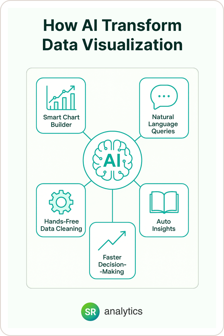
Here’s what I’ve learned: The biggest barrier to better data visualization isn’t technology—it’s time. Your team doesn’t have hours to spend cleaning data and building charts from scratch.
That’s where the future of data visualization gets exciting. AI is now handling the boring stuff so your team can focus on what the data actually means.
What AI-Powered Visualization Looks Like:
- Smart Chart Suggestions: Upload your data, and AI immediately recommends the best way to visualize it. I recently watched a marketing manager upload campaign data and get five different chart options in under 30 seconds—complete with explanations of why each one would work best for different audiences.
- Natural Language Queries: Instead of learning complex software, you can literally ask your dashboard “Show me which products sold best last month” and get an instant visual answer. It’s like having a data analyst on call 24/7.
- Automatic Storytelling: Modern data visualization trends include AI that doesn’t just show you charts—it explains what they mean. As Gartner predicted, by 2025, 75% of data stories would be automatically generated using augmented intelligence and machine learning.
Here’s my rule: If your current BI tool requires a manual to understand, you’re missing out on the future of data visualization. The best tools should feel intuitive from day one.
Modern Data Visualization Trend #2: Real-Time Becomes Non-Negotiable
Remember when getting monthly reports felt fast? Those days are over.
The global trends patterns data visualization 2025 show a clear shift: Static reports are becoming as outdated as printed phone books. According to McKinsey research, companies that inject data and analytics deep into their operations can deliver productivity and profit gains that are 5 to 6 percent higher than those of the competition. Your competitors are making decisions based on live data while you’re still waiting for last month’s numbers.
From my experience, the transformation is dramatic. One manufacturing client went from discovering equipment problems after production delays to preventing them entirely through real-time monitoring dashboards.
Why Real-Time Data Visualization Trends Matter:
You spot problems while they’re still small. Instead of finding out about a customer service issue from online reviews, you see satisfaction scores dropping in real-time and can fix the problem before it goes viral.
Your team makes faster decisions. When you can see inventory levels, sales performance, and customer behavior updating live, you can adjust your strategy immediately instead of waiting for the next planning meeting.
You stay ahead of opportunities. Modern data visualization tools can alert you when unusual patterns emerge—like a sudden spike in interest for a particular product or service.
Quick Win: Start with one real-time dashboard for your most critical business metric. Whether that’s daily sales, customer service response times, or inventory levels, pick the one number that keeps you up at night and make it visible in real-time.
Future Trends In Data Visualization #3: Your Data Tells Stories, Not Just Numbers
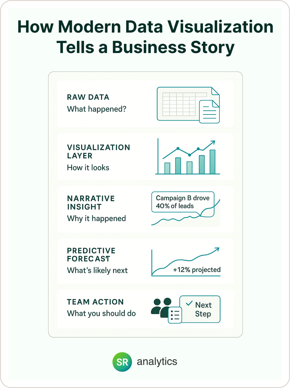
Here’s the thing about modern data visualization: Pretty charts don’t drive action—compelling stories do.
I’ve seen this transformation countless times. Companies show me their existing dashboards, and they’re full of colorful charts and impressive metrics. But when I ask “What action did your team take based on this data?” the room gets quiet.
The future of data visualization is about narrative. Instead of showing you what happened, the best tools now explain why it happened and what you should do about it.
How Data Visualization Trends Are Embracing Storytelling:
- Context-Rich Insights: Instead of just “Sales up 15%,” you get “Sales increased 15% this quarter, compared to the industry average of 8%. The growth was driven by your new email campaign strategy, which generated 40% more qualified leads than previous quarters.”
- Predictive Narratives: Modern data visualization doesn’t just show historical trends—it projects forward. “Based on current patterns, you’re on track to exceed Q4 goals by 12%. Consider increasing production capacity for Product Line A.”
- Collaborative Storytelling: The best future trends in data visualization include features that let your team add context to the data. Sales can explain why certain deals closed, marketing can annotate campaign performance, and operations can provide context for efficiency changes.
Pro tip: Start every data visualization project by asking “What decision is this supposed to help us make?” If you can’t answer that clearly, step back and refine your approach.
Global Trends Patterns Data Visualization 2025 #4: Self-Service Analytics for Everyone
Let me ask you something: How long does it take for someone on your team to get a simple question answered with data? If the answer is “They have to ask IT” or “We wait for the monthly report,” you’re missing a huge opportunity.
The future of data visualization is self-service. Your marketing coordinator should be able to analyze campaign performance. Your sales manager should be able to track pipeline trends. Your operations lead should be able to monitor efficiency metrics. All without submitting a single IT ticket.
What Self-Service Modern Data Visualization Looks Like:
- Drag-and-Drop Simplicity: Modern platforms work like building blocks. Your team can create custom dashboards as easily as making a PowerPoint presentation.
- Role-Based Access: Sales teams see sales metrics, marketing sees campaign data, operations sees efficiency numbers. Same underlying data, different views based on what each person needs to do their job.
- Mobile-First Design: Because decisions don’t wait for you to get back to your desk. The global trends patterns data visualization 2025 clearly show that mobile accessibility isn’t nice-to-have—it’s essential.
Here’s what I look for when evaluating a client’s visualization strategy: Can they answer urgent business questions from their phone while traveling? If not, they’re missing critical decision-making opportunities.
Data Visualization Trends #5: Your Dashboard Knows You Better Than You Know Yourself
The future of data visualization isn’t just personalized—it’s predictive.
I recently worked with a client whose AI-powered dashboard started showing different metrics to different users based on their role and behavior patterns. The sales director saw pipeline forecasts and conversion trends. The marketing manager saw campaign performance and lead quality scores. Same data, completely different perspectives.
But here’s where it gets really interesting: The system learned what each person cared about most and started surfacing those insights automatically.
How Future Trends In Data Visualization Are Getting Personal:
- Adaptive Interfaces: Your dashboard learns your habits and priorities the most important information. If you always check sales numbers first thing Monday morning, they’ll be prominently displayed when you log in.
- Smart Alerts: Instead of getting notification fatigue, you only get alerts about things that matter to your role and decision-making authority.
- Contextual Recommendations: Based on patterns in your data and behavior, the system suggests analysis approaches you might not have considered.
Red flag alert: If everyone in your organization sees the exact same dashboard, you’re not taking advantage of modern data visualization capabilities. Personalization isn’t just about user experience—it’s about effectiveness.
Modern Data Visualization Trend #6: Conversations with Your Data
What if I told you that in 2025, you could have actual conversations with your data?
The future of data visualization includes natural language interfaces that let you ask questions the same way you’d ask a colleague. According to Gartner, more than 55% of all data analysis by deep neural networks will occur at the point of capture in an edge system by 2025.
From my experience implementing these systems, the transformation in how teams interact with data is remarkable. Instead of avoiding data exploration because it’s too complex, team members start asking more questions because it’s so easy.
Conversational Data Visualization Trends in Action:
- Voice Queries: Ask your dashboard questions while driving to a client meeting and get audio responses with the key insights.
- Chat-Based Analytics: Type questions into a chat interface and get instant visual responses, complete with explanations and follow-up suggestions.
- Smart Follow-ups: After you ask one question, the system suggests related questions you might want to explore based on the data patterns it discovers.
The global trends patterns data visualization 2025 show that conversational interfaces are moving from “cool demo” to “daily necessity” faster than most people expected.
Future Of Data Visualization Trend #7: Security That Builds Trust
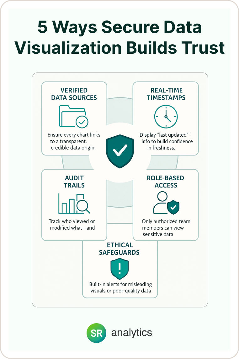
Here’s something I learned the hard way: The fanciest visualization in the world is worthless if your team doesn’t trust the data behind it.
The future trends in data visualization include built-in security and governance features that ensure your insights are not only compelling but credible and compliant.
What Modern Data Visualization Security Looks Like:
- Transparent Data Sources: Every chart includes clear information about where the data came from and when it was last updated.
- Role-Based Security: Team members only see data they’re authorized to access, but the visualization experience remains seamless.
- Audit Trails: Complete tracking of who accessed what data when, which is increasingly important for compliance and troubleshooting.
- Ethical Visualization Standards: Built-in safeguards against misleading charts, including automatic warnings about sample sizes, statistical significance, and data quality issues.
Non-negotiable: If your current visualization tools don’t include governance features, you’re building on shaky ground. The data visualization trends we’re seeing prioritize trust and transparency as much as visual appeal.
What’s Coming Next: The Future Of Data Visualization Gets Even Smarter
While we’ve focused on trends you can implement today, some global trends patterns data visualization 2025 are still emerging:
- Quantum-Enhanced Processing: According to Forrester’s 2025 predictions, quantum computing applications will continue expanding across various industries, eventually enabling visualization of datasets that are impossible to analyze today.
- Immersive AR/VR Experiences: Early adopters are experimenting with data visualization in virtual environments, especially for complex spatial or process data.
- Predictive Visual Modeling: AI that doesn’t just show what happened, but creates visual simulations of what could happen under different scenarios.
These technologies are worth watching, but here’s my advice: Focus your investment on proven modern data visualization capabilities that solve today’s challenges while building a foundation for future innovation.
Real-World Impact: How These Data Visualization Trends Transform Businesses
Let me share a recent example that shows these trends working together.
We worked with a growing e-commerce company that was drowning in data from their website, email platform, social media, and sales systems. They had all the information they needed but couldn’t see the connections.
- The Challenge: Different teams were making decisions based on incomplete pictures. Marketing optimized email campaigns without seeing the full customer journey. Sales focused on closing deals without understanding which marketing touchpoints created the best leads.
- The Modern Data Visualization Solution: We implemented an integrated dashboard that combined all their data sources with AI-powered insights and real-time updating. The system automatically identified the most valuable customer paths and suggested optimization opportunities.
- The Results: Within 60 days, they discovered that customers who engaged with their social content were 3x more likely to become repeat buyers. This insight led to a budget reallocation that increased overall ROI by 34%.
The key wasn’t just prettier charts—it was the combination of future trends in data visualization working together: real-time integration, AI-powered insights, storytelling context, and mobile accessibility.
Conclusion:
The future of data visualization isn’t some distant possibility—it’s happening right now. The data visualization trends we’ve explored represent practical opportunities to make better decisions faster, with confidence in the insights you’re seeing.
The modern data visualization tools available today would have seemed like science fiction just five years ago, but they’re now accessible to businesses of any size. The companies that embrace these changes now will be years ahead of those who wait for “perfect” solutions.
Your next step: Pick one area where the future trends in data visualization could make an immediate impact and start there. The modern data visualization revolution is happening with or without you—the question is whether you’ll be leading the change or scrambling to catch up.
For expert guidance on implementing these strategies, our data visualization consulting services can help you navigate the technology choices and change management challenges.