Ever stared at a spreadsheet full of numbers and felt completely overwhelmed? You’re not alone. Data is everywhere today—from your website analytics to your sales numbers to customer feedback—but making sense of all that information? That’s the hard part.
That’s exactly where data visualization steps in.
In this blog, we’ll break down why data visualization is important for business, explore real-life use cases, and walk you through the different types of data visualization tools available. Whether you’re a business executive, a data analyst, or a small business owner, this guide will help you turn numbers into decisions.
Let’s get visual.
What Is Data Visualization?
Data visualization is the graphical representation of information and data. It transforms raw data into charts, graphs, and maps that are easier for the human brain to process.
Think of it like GPS for your data: instead of staring at a giant list of coordinates, you get a clear map showing where you are and where to go.
Why Do We Need It? H3
- The human brain processes visuals 60,000x faster than text (3M Corporation via NeoMam)
- 90% of information transmitted to the brain is visual
- 50% of our brain is involved in visual processing
So when you turn data into visuals, you’re communicating in the format our brains prefer—fast, clear, and memorable.
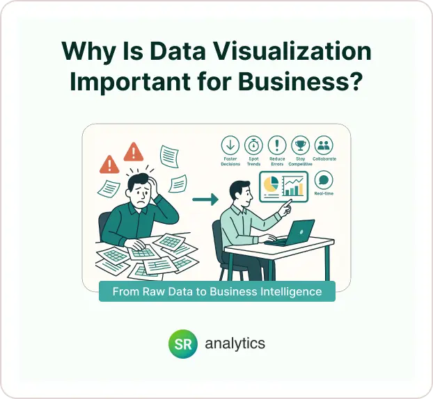
Why Is Data Visualization Important for Business?
Imagine trying to make a decision based on a 10,000-row Excel spreadsheet. Sure, the answers are in there—but it might take you hours (or days) to find them.
Now imagine seeing that same data summarized in a real-time dashboard that highlights your key performance indicators (KPIs), trending metrics, and customer behaviors. That’s the power of visualization—it turns information overload into insights.
So, why is data visualization important?
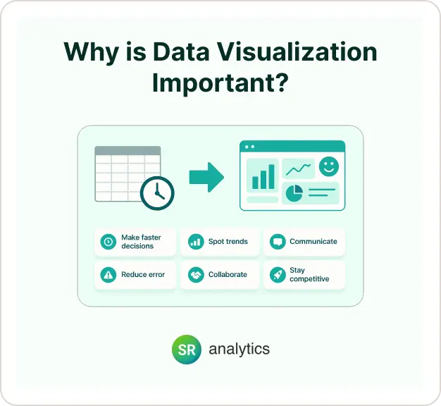
Because it helps businesses:
- Make faster decisions
- Spot trends and patterns
- Communicate clearly
- Reduce human error
- Collaborate more effectively
- Stay competitive in a data-saturated world
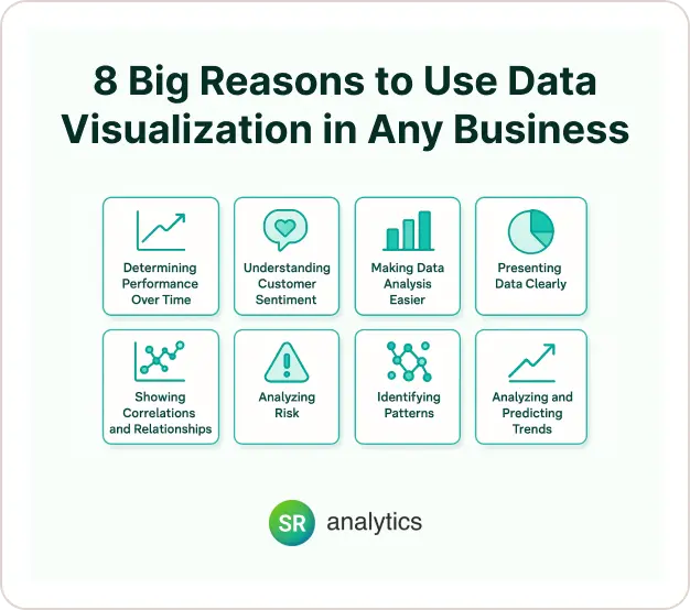
8 Big Reasons to Use Data Visualization in Any Business
We live in a data-driven world. Every business—from local shops to global brands—is collecting more information than ever before. But raw data alone doesn’t drive growth. Understanding and acting on that data is what makes the difference.
That’s where data visualization comes in.
It turns rows of numbers into clear, visual insights. Instead of digging through spreadsheets, you get a chart that tells the story instantly.
So, why is data visualization important for business? Let’s break it down with 8 practical reasons—and real-world value.
1. Determining Performance Over Time
Tracking business performance is easier when you can see the results.
- Use line graphs or bar charts to visualize monthly revenue, customer growth, or expenses.
- Spot trends quickly—like seasonal dips or growth spikes.
- Save time by replacing dense reports with a real-time dashboard.
Why it matters: Visuals show your progress clearly, so you can adjust faster and plan smarter.
2. Understanding Customer Sentiment
Want to know how your customers really feel?
- Turn survey results into pie charts or word clouds.
- Track online reviews or support tickets using sentiment dashboards.
- Visualize positive vs. negative feedback by location or topic.
Why it’s important: Visualization helps you act on feedback and build better customer relationships.
3. Making Data Analysis Easier
Data doesn’t have to be complicated.
- Use visuals to explore large datasets without code.
- Identify outliers, trends, or gaps in minutes—not hours.
- Share charts that everyone on your team can understand.
Key benefit: You reduce confusion and uncover insights faster.
4. Presenting Data Clearly
Charts aren’t just for analysts—they’re for storytelling.
- Use dashboards in meetings to highlight KPIs.
- Create simple bar or donut charts for reports.
- Share infographics in presentations or emails.
Why visualization works: People understand pictures faster than paragraphs.
Tip: A chart can often replace 500 words of explanation.
5. Showing Correlations and Relationships
Want to know if one factor affects another?
- Use scatter plots to show relationships (e.g., marketing spend vs. revenue).
- Highlight patterns in behavior or spending habits.
- Find hidden links in customer data.
Why it helps: Correlation visuals show what’s really driving results.
6. Analyzing Risk
Every business has risks. Visualization makes them easier to spot.
- Color-coded dashboards show financial red flags.
- Heatmaps reveal high-risk areas in operations.
- Real-time alerts catch issues early.
Why this matters: You can prevent problems before they hurt your bottom line.
7. Identifying Patterns
Patterns hide in plain sight—if you know where to look.
- Use dashboards to detect repeat behaviors.
- Spot recurring sales dips or busy hours.
- Track inventory cycles, customer visits, or support tickets.
What’s the benefit? Recognizing patterns helps you streamline and optimize.
8. Analyzing and Predicting Trends
Want to see what’s coming next?
- Track year-over-year growth on line graphs.
- Forecast sales based on past data.
- Visualize website traffic spikes after campaigns.
Why is data visualization important for business planning? Because trends tell you when to act—and when to wait.
Key Benefits of Data Visualization
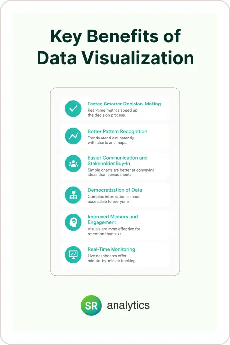
1. Faster, Smarter Decision-Making
When executives and managers can see real-time metrics displayed clearly, they can act quickly. Dashboards make it easy to identify what’s working and what’s not—no more waiting on monthly reports or gut instincts.
Stat to Know: Companies using data visualization tools are 28% more likely to find timely information than those relying on traditional tools. — Forbes Insights
2. Better Pattern Recognition
Line graphs, heat maps, and bar charts make trends stand out instantly. This helps you understand customer behavior, seasonal fluctuations, and performance changes over time.
Example: A retail chain used sales heatmaps to discover underperforming stores and adjust their regional marketing efforts, resulting in a 20% revenue increase.
3. Easier Communication and Stakeholder Buy-In
Want to convince your leadership team to invest in a new tool? A simple pie chart showing ROI works better than a spreadsheet full of numbers.
“Adding a chart to a claim increased belief in its accuracy from 68% to 97%.” — Cornell University Study via CSG Solutions
4. Democratization of Data
Visualizations make complex information accessible to everyone—not just data scientists. That means sales teams, marketers, and even frontline employees can interact with data and make informed choices.
Fact: 86% of business leaders believe data literacy will be as important as reading and writing in the next five years. — Data Literacy Project
5. Improved Memory and Engagement
Visuals help people retain and recall information more effectively. That’s critical when you’re presenting to stakeholders or trying to educate employees.
“People remember 80% of what they see, compared to just 20% of what they read.” – HubSpot Blog
6. Real-Time Monitoring
Modern BI tools like Power BI and Tableau allow for live dashboards, enabling decision-makers to track progress minute-by-minute.
Example: An eCommerce brand used a live dashboard to monitor inventory and adjusted in real time during Black Friday, avoiding stockouts and doubling sales YoY.
Examples of Data Visualization in Action
Let’s put the theory into practice. Here are a few real-world examples of data visualization driving business decisions:
Sales Performance Dashboard
Scenario: A sales director wants to track weekly revenue across 10 regions.
Before: Raw spreadsheet with sales per rep, product, and territory.
After: A dashboard with:
- A bar chart showing top-performing reps
- A heat map of sales by region
- A trend line showing weekly performance
Result: The team identifies the lowest-performing region and launches a targeted incentive program.
Marketing ROI Tracker
Scenario: A marketing team tracks ad campaign performance.
Before: Dozens of CSV files from Facebook, Google Ads, and LinkedIn.
After: A consolidated dashboard:
- Pie chart of budget spend by channel
- Line graph showing conversions over time
- Table comparing cost-per-lead (CPL) by source
Result: They shift budget to the highest-converting channel, cutting CPL by 30%.
HR Attrition Report
Scenario: HR needs to understand employee turnover trends.
Dashboard includes:
- Trendline of attrition rate over time
- Bar chart of resignations by department
- Map of office locations with turnover hotspots
Result: HR identifies one high-risk location and launches a retention initiative, reducing churn by 15%.
Types of Data Visualization
There’s a visual for every kind of story your data wants to tell. Here are some of the most common types of data visualization formats:
Type of Visualization | Best For |
|---|---|
| Bar Charts | Comparing quantities (e.g. sales by product) |
| Line Charts | Showing trends over time |
| Pie/Donut Charts | Showing parts of a whole |
| Heat Maps | Highlighting concentrations or intensities |
| Scatter Plots | Identifying correlations between variables |
| Tree Maps | Visualizing hierarchical data |
| Gantt Charts | Project timelines and progress |
| Dashboards | Combining visuals into an interactive report |
| Word Clouds | Visualizing text or sentiment frequency |
Each type serves a different purpose. The key is choosing the right visual for your goal—don’t try to tell a timeline story with a pie chart.
Data Visualization and Big Data: Why They Work Best Together
In today’s data-driven world, businesses generate and collect vast amounts of information from websites, social media, sensors, and apps. This is what we call big data—and it’s only growing. But raw data is useless without clarity. That’s where data visualization and big data go hand in hand.
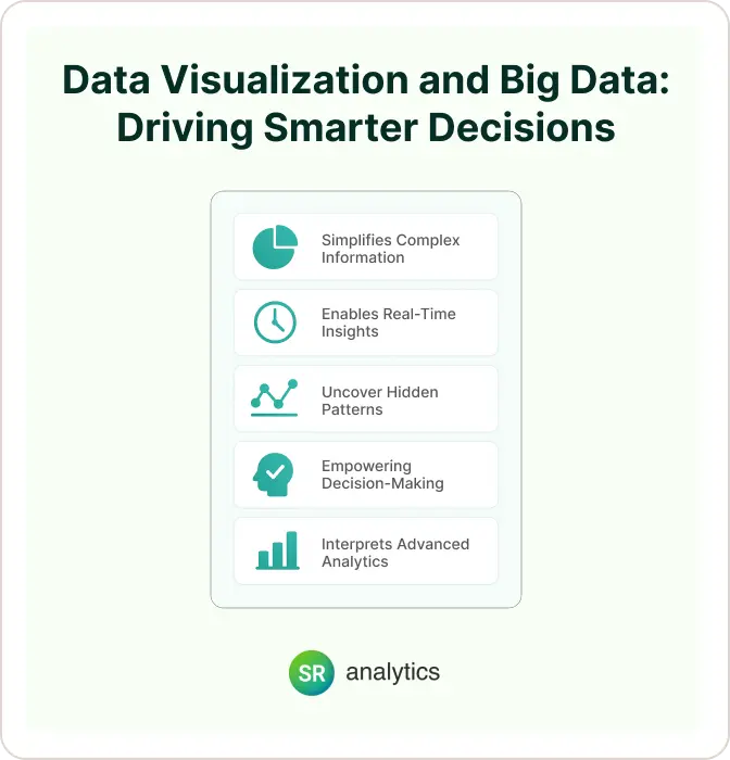
Here’s why data visualization is essential in the big data era:
✅ Simplifies Complex Information
Visualization tools distill billions of data points into easy-to-read charts, graphs, and dashboards.
✅ Speeds Up Real-Time Analysis
With live dashboards, teams can visualize big data streams and react to trends or issues instantly.
✅ Reveals Hidden Patterns and Outliers
Data visualization and big data together uncover insights that would be impossible to spot in raw tables.
✅ Enhances Decision-Making
Visual summaries help non-technical teams make sense of complex datasets, boosting data literacy across organizations.
✅ Powers Advanced Analytics
From AI models to predictive analytics, visual tools explain outputs in ways stakeholders understand.
Statista reports the world will generate over 181 zettabytes of data by 2025. Without visualization, big data becomes just noise.
Data visualization and big data are a powerful duo—one captures complexity, the other turns it into insight.
Best Practices for Effective Data Visualization
Bad visuals are worse than no visuals. Here’s how to get it right:
Choose the Right Chart : Don’t use a pie chart for time-series data. Match your chart to the message you want to convey.
Keep It Simple : Avoid chart junk—like 3D effects, unnecessary legends, or rainbow color schemes. Your visual should enhance clarity, not confusion.
Use Color with Purpose : Highlight key insights (e.g., red for alerts, green for growth) but avoid overloading your viewers.
Add Context : Every visual should include labels, legends, and titles that tell the viewer what they’re looking at—and why it matters.
Think Mobile : Use responsive dashboard tools that look great on both desktops and smartphones.
Getting Started: Tools and Services
You don’t need to be a data scientist to get started with data visualization. Here are a few popular tools to explore:
| Tool | Use Case |
|---|---|
| Microsoft Power BI | Great for small to mid-size businesses |
| Tableau | Ideal for interactive dashboards and analytics |
| Google Looker Studio | Free option for marketers and website data |
| Excel/Google Sheets | Good for basic visuals and small datasets |
| SR Analytics | Custom dashboard consulting and visualization services |
Conclusion: Visualization Turns Data Into Direction
In today’s fast-paced, data-saturated world, businesses can’t afford to overlook the power of data visualization. It’s no longer just about collecting numbers—it’s about turning those numbers into stories that guide smarter, faster decisions. Whether you’re identifying trends, optimizing performance, or aligning teams, visuals help you cut through the noise and focus on what matters.
The real value of data isn’t in the data itself—it’s in what you do with it. And without clear, compelling visuals, even the best data can get lost in translation. The benefits of data visualization are clear: from small business owners to Fortune 500 executives, data visualization is the bridge between information and insight.
So if you’re serious about becoming a data-driven organization, don’t just store your data—visualize it. Understanding the right types of data visualization to use for your specific goals can make all the difference in turning raw data into actionable insights.
Need help getting started? SR Analytics is here to help you build custom dashboards and unlock the full potential of your data.
Let’s turn your data into action—together.