
TL;DR:
- Truncated axes make small changes look massive, costing one retail client $600K in misallocated marketing spend
- Wrong chart types lead to flawed decisions; an e-commerce client reduced inventory costs by 18% just by switching to bar charts
- Missing labels force executives to guess, wasting 6+ hours weekly in clarification meetings
- Color and design overload reduces comprehension by up to 40%, according to Nielsen Norman Group research
- Information congestion violates cognitive load principles; humans can only process 7±2 chunks of information at once
Your VP just approved a $4 million budget increase.
She based it on a bar chart from last quarter’s dashboard. The chart showed a 47% jump in customer acquisition. It looked incredible. Everyone nodded.
The problem? The Y-axis started at 35%, not zero. The real growth was 8%.
You’ll catch it in three months when the numbers don’t add up. By then, you’ve already hired six people and signed a lease on that satellite office.
This happens more than you think. A 2025 SoftServe study found that 58% of business leaders admit to making key decisions based on inaccurate or inconsistent data. The culprit isn’t usually the numbers themselves. It’s how they’re displayed.
Bad data visualization doesn’t just confuse people. It costs money. Real money. Gartner research indicates that poor data quality costs organizations an average of $12.9 million annually, and misleading visualizations are a primary contributor.
Here are the five mistakes I see most often when auditing client dashboards. If you’re making any of these, your team is probably making decisions on flawed information right now.
Quick Answer
Bad data visualization occurs when charts obscure insights through truncated axes, wrong chart types, missing labels, color overload, or information congestion. These mistakes cost businesses an average of $12.9 million annually and lead to flawed decisions based on misleading visuals.
What is Bad Data Visualization?
Data visualization presents information graphically that highlights patterns and trends in data. It helps the viewers gain quick insights into data analysis.
It revolves around both data science and art. While the analytical brain is required to understand the data and analyze it, art plays a crucial role in representing it in appealing visuals.
To avoid data visualization errors, it’s required that you strike the right chord between data points and presentation. Using too many colors, incorrect charts, and presenting too much information through one graph are some of the mistakes that data analysts often make. And these, in turn, will make a decision-maker’s life more difficult than easier!
Mistake #1: Starting Your Axis Anywhere But Zero
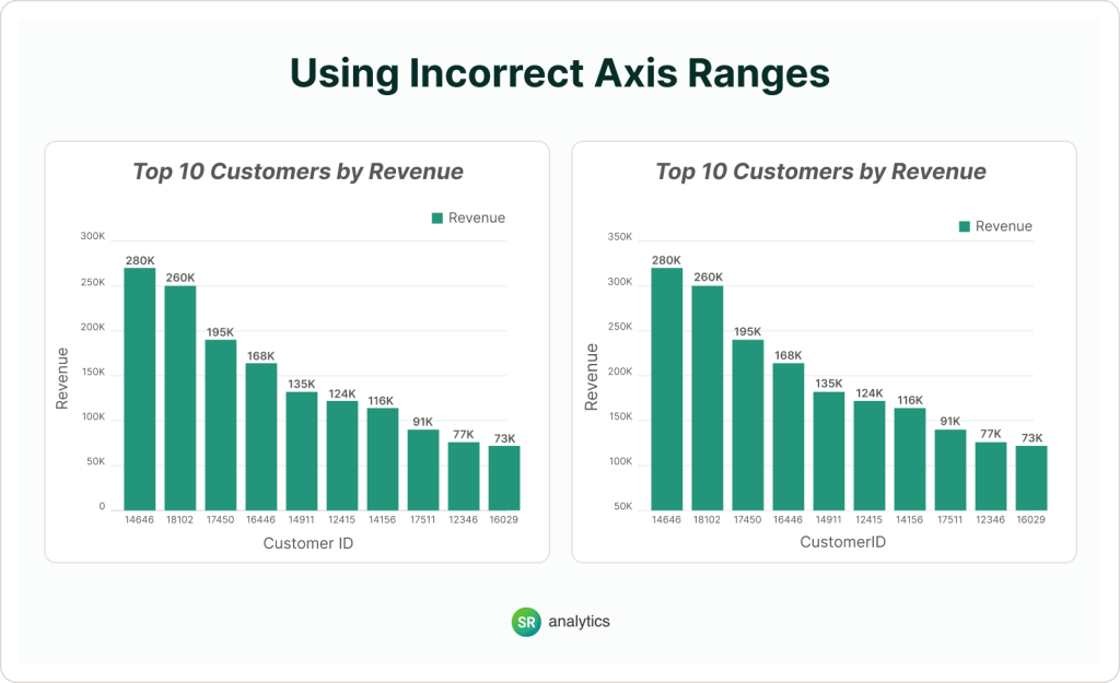
Incorrect axis ranges mislead viewers by exaggerating differences. Bar charts are very commonly used, and most viewers conclude by looking at the height of the bars. Someone built a bar chart and decided to start the Y-axis at 50 instead of 0. Maybe they wanted to “zoom in” on the data. Maybe the charting tool defaulted to it.
Doesn’t matter. The result is the same: a 5% difference looks like a 500% difference.
Your brain processes bar charts by comparing heights. When you truncate the axis, those heights lie. A product that’s performing 2% better than last month suddenly looks like it’s dominating. You allocate a budget accordingly. You’re now overfunding mediocrity.
I watched a retail client do this with regional sales data. Their Southeast region looked like it was crushing the Northeast with bars three times taller. They shifted $600K in marketing spend based on that visual.
Actual difference? 4%.
Research from the Nielsen Norman Group shows that truncated axes in data visualization can distort perception by up to 400%, leading to systematically flawed decision-making. This isn’t a minor design choice. It’s a fundamental misrepresentation of reality.
The fix:
Start your Y-axis at zero. Every time. No exceptions.
If your data range is too narrow (like comparing 94% to 97%), use a line chart or add context in the title: “Customer Satisfaction Holds Steady Near 95%.”
Check your intervals. 0, 100, 150, 200 is not an interval. That’s someone who doesn’t understand what they’re building.
How to spot this in your dashboards:
Open Power BI or Tableau right now. Click on any bar chart. Look at where the Y-axis starts. If it’s not zero, you’ve been misleading your team. For more guidance on proper axis scaling and chart fundamentals, check our comprehensive guide on data visualization techniques.
Mistake #2: Being “Creative” With Chart Types
Overly creative designs can hide the data’s meaning. Charts and graphs used in dashboards are meant to give you a correct and precise idea of the underlying data. Someone got bored with bar charts. They wanted something that “popped” in the presentation. So they used a pie chart to show quarterly trends. Or a 3D exploding donut to compare five product lines. Or (and I’ve actually seen this) a radar chart for monthly revenue.
Different charts exist for different jobs. A pie chart shows parts of a whole. That’s it. You use it when you have 3 to 5 categories that add up to 100%.
You don’t use it for time series data visualization. You don’t use it for trends. You definitely don’t use it when you have 12 categories and three of them are under 2% each.
But people do it anyway because they think standard charts are “boring.” Know what else is boring? Explaining to your CFO why you recommended killing a profitable product line because you couldn’t read your own chart.
The fix:
Match the chart to the data type. Time series data needs line charts. Category comparisons need bar charts (horizontal if the labels are long). Parts of a whole get pie charts, only if you have 5 or fewer slices. Distribution analysis requires histograms. Correlation between two variables demands scatter plots.
Stop trying to be original. Your chart’s job is to make the answer obvious in three seconds. That’s it.
Real consequence:
An e-commerce client came to us with a “creative” dashboard. Their product team had built a bubble chart to show inventory levels across categories. Pretty. Colorful. Completely useless.
They couldn’t tell which products were actually low on stock. They kept over-ordering slow movers and running out of bestsellers. Took us 20 minutes to replace it with a simple sorted bar chart. Inventory carrying costs dropped 18% in the next quarter.
For more examples of visualizations that actually work (and why), explore our analysis of the best data visualization examples featuring real-world implementations from NASA, FiveThirtyEight, and ProPublica.
Mistake #3: Forgetting That People Need to Read Your Chart
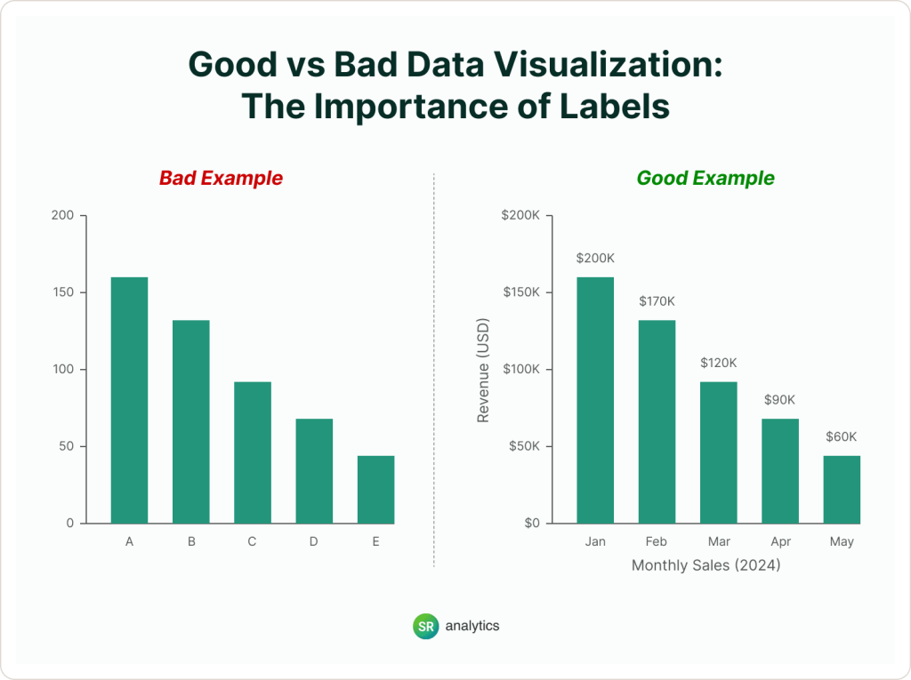
Missing labels make graphs hard to understand. No title. No axis labels. No legend. Or worse: labels that are there but invisible because someone used light gray text on a white background.
I can’t count how many dashboards I’ve reviewed where I had to ask, “What am I looking at?” And these are dashboards that executives use weekly.
If your audience has to guess what the numbers mean, they will guess wrong. And they’ll remember that your reports waste their time.
The fix:
Every chart needs a clear title that states the point (not “Q3 Sales” but “Q3 Sales Down 12% YoY”), axis labels showing what’s being measured and in what units, a legend if you’re comparing multiple things, and data labels on the actual chart if precision matters.
Use contrasting colors. Black text on white background. White text on dark background. Not gray on gray. Not red on orange. Not whatever your brand team thinks looks “sophisticated.”
Quick test:
Send your dashboard to someone who’s never seen it. Give them 30 seconds. Ask them what it says. If they can’t tell you, your labels are broken.
According to Stanford University research on data visualization, properly labeled charts reduce interpretation time by 60% and eliminate 80% of clarification questions in business meetings. Those aren’t small numbers. That’s the difference between productive meetings and time-wasting confusion.
This principle becomes even more critical when working with business intelligence dashboards that executives rely on for strategic decisions. One unlabeled axis can derail a million-dollar decision.
Mistake #4: Designing Dashboards Like You’re Decorating a Christmas Tree
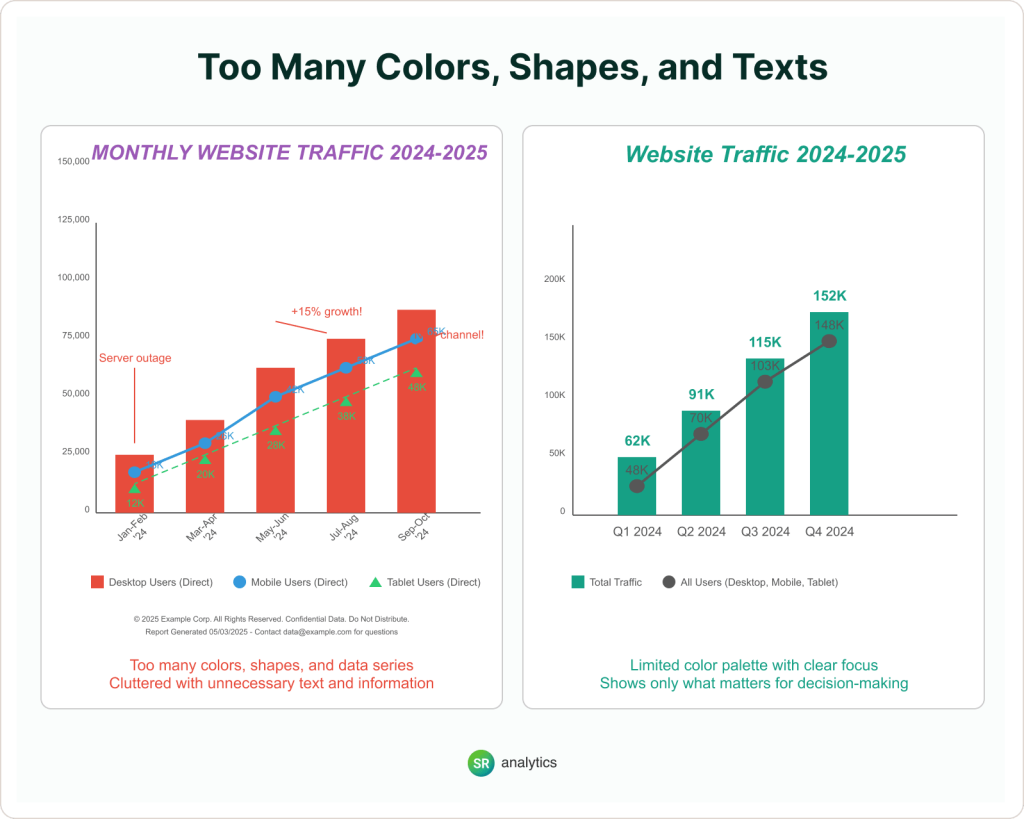
Too many colors, shapes, and words clutter dashboards and confuse readers.
You’re not creating art. You’re delivering information. Every extra element you add is one more thing your reader has to process before they get to the actual insight.
Color has a psychological impact. Red signals danger or losses. Green signals growth or profit. Blue signals trust. When you use all of them randomly across a dashboard, you’re creating cognitive noise.
I’ve seen dashboards with 12 different colors representing nothing. Heat maps where the gradient goes from purple to yellow to green for no reason except “it looks cool.” Reports where every number is bolded and highlighted, which means nothing stands out.
The fix:
Use color intentionally. Reserve bright colors for the most important data. Everything else gets gray or muted tones. Standardize: if the USA is blue in one chart, it’s blue in all charts. If revenue is green, it’s always green.
Add white space. Margins aren’t wasted space. They’re breathing room. Delete everything that isn’t absolutely necessary.
Color guidelines for data visualization:
- Limit your palette to 3 to 5 colors maximum
- Use color to highlight, not decorate
- Ensure sufficient contrast (4.5:1 minimum for accessibility)
- Test for colorblind accessibility (8% of men have red-green colorblindness)
- Keep backgrounds neutral (white, light gray, or dark charcoal)
We’ve documented these principles extensively in our guide to data visualization best practices.
Mistake #5: Cramming Everything Into One Chart (Information Congestion)
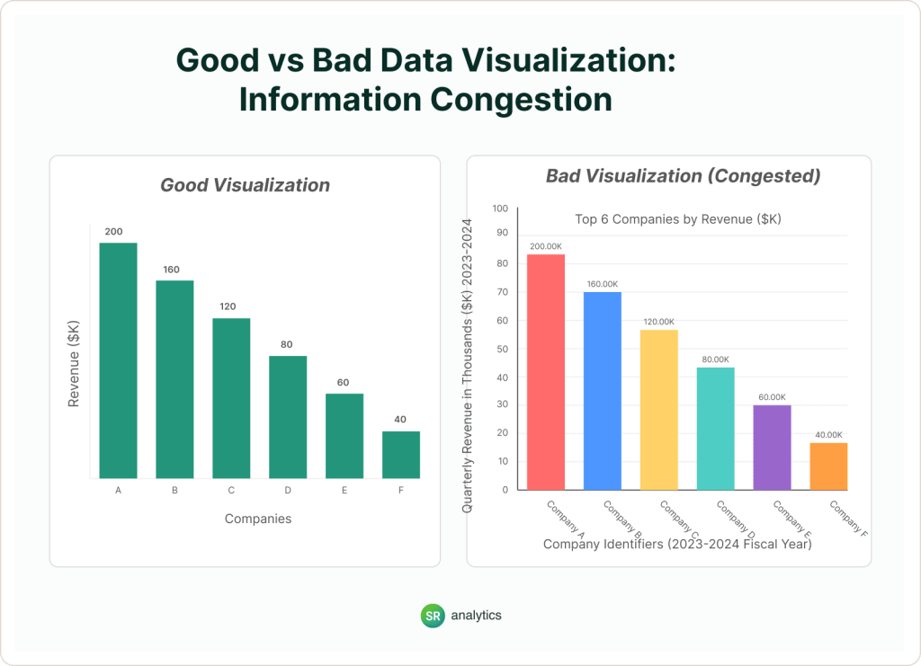
Too much data in one chart overwhelms viewers. According to a study by George Miller of Harvard, the human mind can handle seven pieces of information on average, which can be more if the information is chunked.
Someone decided that one chart showing everything is better than multiple focused charts. So they crammed regional sales, product categories, time trends, and customer segments into a single visualization.
The result? Nobody can extract any insight. Eyes glaze over. The chart gets ignored.
Cognitive load theory tells us that working memory is limited. When you exceed that capacity, comprehension drops to near zero. Your audience might spend 5 minutes staring at your chart and still walk away with no actionable insight.
The fix:
Split it up. One insight per chart. If you need to show 15 product categories, create a “Top 5” chart and an “Everything Else” table.
Your job isn’t to show all the data. It’s to help someone make a decision.
Best practices for managing information density:
- Maximum 5 to 7 data series per chart
- Use small multiples (multiple small charts) instead of one complex chart
- Create drill-down functionality for detail-oriented users in tools like Power BI
- Prioritize the insight, not a comprehensive data display
- Use tables for precision, charts for patterns
Why Bad Data Visualization Causes Business Problems
Bad data visualization leads to misunderstandings. A SoftServe study revealed that 65% of business leaders believe no one in their organization fully understands the aggregated data or how to access it.
Additionally, 58% reported making key business decisions based on inaccurate or inconsistent data because of misleading charts, like a bar graph that made a small sales increase look huge by cutting off the bottom, leading them to spend too much on a product that wasn’t doing well.
Direct costs:
- Misallocated budgets based on misleading charts
- Delayed decisions due to chart confusion
- Wasted meeting time clarifying visualizations
- Lost productivity from teams second-guessing data
Indirect costs:
- Eroded trust in data and analytics teams
- Executives reverting to “gut feel” decisions
- Decreased adoption of business intelligence tools
- Competitive disadvantage from slower decision velocity
Real-world impact:
A financial services client came to us after their risk committee approved an investment based on a scatter plot that made outlier risks look negligible. The visualization used inconsistent scales and misleading axes. Result: $2.3M loss on an investment that should have been flagged as high-risk.
What Makes a Good Data Visualization?
Good data visualization is the inverse of everything we’ve discussed. It has clarity (the main insight is obvious within 3 seconds), accuracy (scales, axes, and proportions faithfully represent the data), simplicity (no unnecessary elements that distract from the message), context (proper labels, titles, and reference points), and accessibility (readable by all users, including those with visual impairments).
- Too much stuff, like a scatter plot with 100 points and no labels.
- Wrong chart types, like a 3D pie chart for simple numbers.
- Confusing colors, like using shades that are too similar.
- No explanations, like a line chart with no dates.
- Scales that trick the eye, like starting a graph at 50% instead of 0%.
For organizations handling massive datasets, understanding the advantages of big data visualization becomes critical. The principles remain the same at scale, but the technical implementation requires more sophisticated infrastructure.
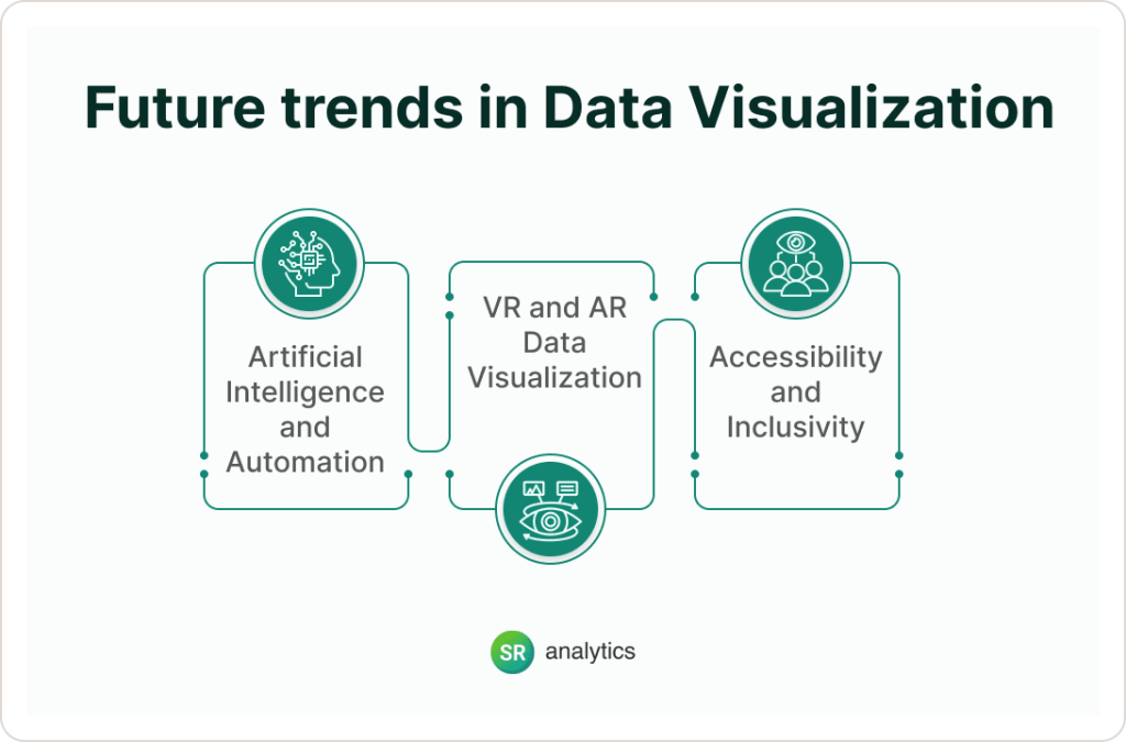
What’s Coming for Data Visualization in 2025 and Beyond?
Data visualization will get better with AI, VR, and more focus on everyone using it. With technological advancements and rising user expectations, these are some trends worth monitoring:
- Artificial Intelligence and Automation
The automated creation of data visualizations will increasingly be driven by AI, providing instant insights and surfacing deeper patterns with minimal human effort. - VR and AR Data Visualization
VR and AR will change the way we work with data, allowing you to move around in a 3D atmosphere and intuitive experience of complex data sets. - Accessibility and Inclusivity
Designing visualizations that are accessible to everyone — especially users with visual, motor, or cognitive impairments — will be among the most important priorities in 2025, striving for inclusivity in how we convey data.
What Happens Next
You’re probably wondering if your dashboards have these problems.
They do. I’ve reviewed over 200 dashboards in the past two years. Only three didn’t have at least one of these issues. And two of those three were built by data visualization specialists.
The question isn’t whether you’re making these mistakes. It’s whether they’ve cost you anything yet.
Maybe the budget got misallocated. Maybe a product decision got delayed because nobody trusted the chart. Maybe your executive team stopped looking at the reports altogether because they “never make sense.”
Most companies don’t notice until it’s obvious. A hiring mistake. A missed opportunity. A quarter of bad decisions is compounding.
Here’s what changes when you fix this: your team stops asking “What does this mean?” in meetings. Decisions happen faster. Executive buy-in comes easier. You stop re-explaining the same data three different ways.
And (this matters more than people admit), you look more competent. The person who brings clear, trustworthy data gets listened to. The person who brings confusing charts with truncated axes gets tuned out.
Conclusion
Bad data visualization examples, like tricky line charts or messy pie charts, makes it hard to understand data and can lead to mistakes. By knowing what goes wrong—like cramming too much in or using the wrong chart—and using simple tips with tools like Tableau, you can make visuals that are easy to understand and help make better choices.
Speak with one of our data visualization consultants! Fill out the form below and we will get in touch.


