
Highlights
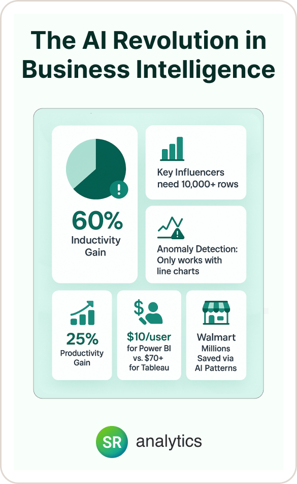
- 60% of Power BI AI implementations fail due to poor strategy, not technical issues
- Key Influencers needs 10,000+ rows for reliable results, minimum 1,000
- Companies achieve 25% productivity gains with proper AI visual implementation
- Anomaly Detection only works with line charts, can’t combine with forecasting
- Power BI costs $10/user vs Tableau’s $70+ monthly for superior AI features
- Limit 2-3 AI visuals per page to maintain performance and adoption
- Walmart identified millions in savings through AI-discovered patterns
Introduction
In the next 10 minutes, you’ll discover how to implement Power BI AI visuals that actually work. I’m talking about the same techniques that helped Walmart analyze trillions of transactions[1] and T-Mobile achieve 11x faster insights using Power BI new features.
Here’s the thing about most Power BI dashboard tutorials: they show you where to click. This guide shows you how to think.
Because the difference between AI based visuals in Power BI that deliver 25% productivity gains[2] and those that crash your Power BI reports isn’t technical knowledge – it’s implementation strategy.
Whether you’re exploring Key Influencers, setting up Q&A, or implementing Anomaly Detection in your Power BI dashboard, I’ll share the exact framework that separates the 40% of successful implementations from the 60% that fail according to recent industry research[3]. No fluff, no theory – just proven techniques backed by real company data.
The AI Revolution in Business Intelligence
Business intelligence has fundamentally changed, and honestly, it’s about time. With 95% of US companies now using AI (up 12 percentage points year-over-year), the question isn’t whether to use AI based visuals in Power BI – it’s how to use them effectively.
Power BI, commanding a 36.53% market share in business intelligence, has emerged as the dominant platform for AI-powered analytics.
Traditional Power BI dashboards show you what happened. Power BI AI visuals tell you why it happened and what might happen next. I’ve seen these real-world impacts firsthand across dozens of client implementations:
Faster Decision Making: Companies report decisions that previously took days now happen in hours using Power BI new features.
Deeper Insights: AI identifies patterns humans miss in datasets with billions of rows.
Democratized Analytics: Business users can ask questions in plain English without SQL knowledge in their Power BI reports.
Proactive Intelligence: Anomaly detection catches issues before they become expensive problems.
Microsoft’s integration of Azure AI services, Copilot, and Power BI creates an ecosystem that frankly, competitors can’t match. While Tableau charges $70+ per user monthly, Power BI delivers superior AI based visuals in Power BI at just $10/user/month.
This isn’t just about cost – it’s about accessibility. When Forrester rated BI platforms in Q2 2025, Power BI received the highest score for generative AI functionality.
But here’s the reality check: despite these advantages, recent research reports that 60% of BI projects fail to deliver expected value. The primary culprit? Poor implementation.
Power BI AI visuals require different thinking than traditional charts. They need quality data, proper relationships, and most importantly, the right use case. Get these wrong, and your cutting-edge AI Power BI dashboard becomes an expensive spreadsheet.
“Curious what AI visuals actually look like in Power BI? This video walks through them in action. Watch it first, then continue below to see how you can apply the same techniques to your own dashboard.”
Complete Guide to Power BI's AI Visuals
Let me walk you through each AI based visual in Power BI in detail. I'll explain not just what they do, but when and how to use them effectively in your Power BI reports.
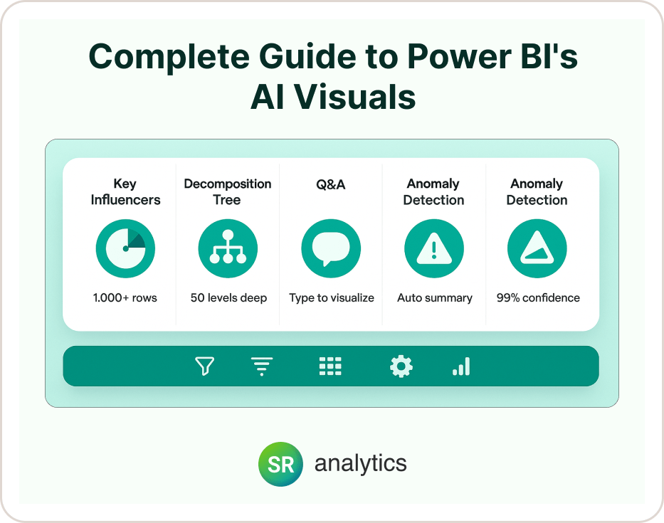
Key Influencers Visual: Your Statistical Detective
Think of Key Influencers as your data detective. Introduced in 2019 and continuously enhanced as one of the most powerful Power BI new features, it automatically analyzes your data to find statistically significant factors affecting your chosen outcome.
For instance, if you're analyzing customer satisfaction scores in your Power BI dashboard, it might reveal that delivery time has 2.5x more impact than price.
I've seen this visual transform decision-making across these real business applications:
Sales Analysis: "What drives high-value deals in our Power BI report?" reveals which factors correlate with bigger wins.
HR Analytics: "Which factors predict employee turnover?" helps retention strategies before problems escalate.
Customer Success: "What influences satisfaction scores?" identifies levers teams can actually control.
Operations: "What causes production delays?" pinpoints bottlenecks that matter most.
The technical requirements are straightforward but critical. You need a minimum of 1,000 records, though I recommend 10,000+ for reliable insights. You'll also need a target metric (what you're analyzing in your Power BI dashboard), explanatory fields (potential influencers), and clean categorical data.
Here's my pro implementation tip that I wish someone had told me years ago: start with 5-10 potential influencers when building Power BI AI visuals. Adding too many fields (like individual customer IDs) creates noise and kills performance. Group high-cardinality fields first – analyze "Customer Segment" not "Customer ID."
Decomposition Tree: Interactive Root Cause Analysis
Decomposition Tree, one of the groundbreaking Power BI new features launched in November 2019, lets you drill down through your data hierarchically, with AI suggesting the most impactful paths. It's like having an analyst who instantly knows which dimension to explore next in your Power BI report.
I love using this for revenue analysis where you can drill from total revenue to region to product to salesperson. It's equally effective for cost investigation to identify specific cost drivers across departments, performance metrics to understand variations across dimensions in your Power BI dashboard, and honestly, any scenario where you need to understand the "why" behind your numbers.
The visual supports up to 50 levels deep and handles 5,000 data points efficiently. The AI Splits feature finds high/low value paths automatically, which is where the real magic happens.
Let me share a success story that perfectly illustrates its power: a retail client used Decomposition Tree in their Power BI report to analyze $2M in unexpected costs. Within minutes, they identified that 73% came from one supplier in one region during specific months – insight that would have taken days manually.
Q&A Visual: Natural Language Analytics
Q&A transforms your Power BI dashboard into a conversational analyst. Originally introduced in 2014, this AI based visual in Power BI has been enhanced continuously with major updates in March 2025. Users type questions in plain English and get instant visualizations.
The practical applications are endless. Here are some query examples that work beautifully in Power BI reports:
"Show me sales by region last quarter" – Creates instant regional comparison charts.
"What's our average deal size this year vs last year" – Generates year-over-year analysis automatically.
"Top 10 customers by revenue" – Builds ranked customer lists with visual comparisons.
"Monthly trend of customer complaints" – Produces time-series analysis of support metrics.
Setting this up properly makes all the difference. Use business-friendly field names (rename "Cust_Sat_Score" to "Customer Satisfaction"), add synonyms ("Revenue" = "Sales", "Income"), create featured questions for common queries in your Power BI dashboard, and test with actual business users before deployment.
Here's a common mistake I see all the time: don't assume Q&A understands your business context. If you call customers "clients" internally, add that synonym. Small setup investments pay huge usability dividends for Power BI AI visuals.
Smart Narrative: Automated Insights in Plain English
Smart Narrative, available since 2020 as one of the most innovative Power BI new features, automatically generates dynamic text summaries of your data. As users interact with filters in your Power BI report, the narrative updates to reflect current selections.
I find this incredibly powerful for executive Power BI dashboard summaries, automated report commentary, dynamic performance explanations, and cross-visual insights integration.
Here's what a typical implementation looks like:
"Sales increased by % this quarter, driven primarily by region. showed the strongest performance with % growth. Notable exception: declined by % due to ."
The beauty is in automation. Your executives get context without manual report writing, and the insights stay current as data changes.
Anomaly Detection: Your Early Warning System
Anomaly Detection, another powerful AI based visual in Power BI, entered preview in 2020 and reached general availability in 2021. It uses machine learning to identify unusual patterns in time-series data within your Power BI reports, providing both detection and explanation of anomalies with confidence scoring up to 99%.
The business value is tremendous across industries:
Quality Control: Detect manufacturing defects before they reach customers and impact brand reputation.
Financial Monitoring: Identify unusual transactions in your Power BI dashboard that could signal fraud or system errors.
Performance Tracking: Spot metric deviations that indicate process problems or opportunities.
Operational Intelligence: Catch system issues early before they cascade into major outages.
Configuration matters enormously here. Set sensitivity between 85-95% because going too high creates false positives. You need a minimum of 30 data points for reliable detection, consider seasonality in your data, and always review explanations before taking action.
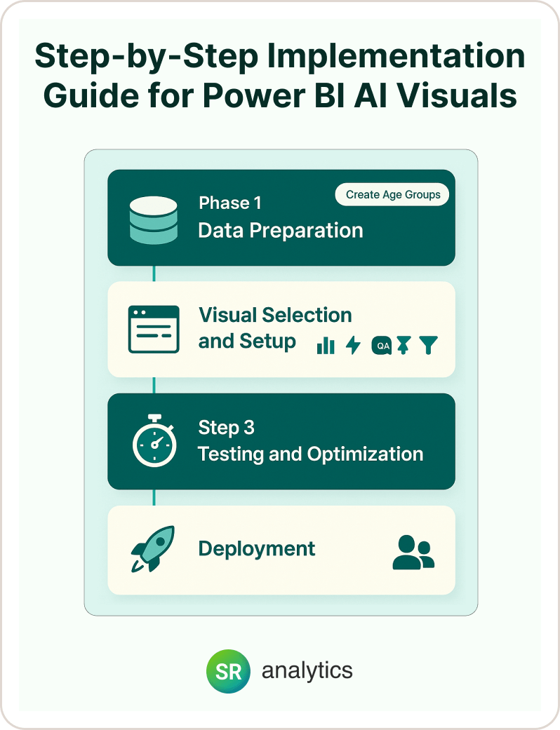
Step-by-Step Implementation Guide for Power BI AI Visuals
Let me walk you through implementing AI based visuals in Power BI correctly from the start. I've learned these lessons the hard way, so you don't have to.
Phase 1: Data Preparation for Your Power BI Dashboard
Before adding any Power BI AI visual to your Power BI report, you need to audit your data model. This means ensuring your data model follows best practices.
Your foundation should include:
Star schema design: Fact tables surrounded by dimension tables for optimal performance.
Proper relationships: Correct cardinality settings that reflect your actual business logic.
Clean data types: Dates stored as dates, numbers as numbers, text as text consistently.
Minimal missing values: Under 5% for key fields to ensure reliable AI analysis.
Power BI new features have specific requirements that differ from traditional visuals. Remove high-cardinality fields from explanatory variables, create categorical buckets for continuous variables, ensure sufficient data volume (1,000+ rows minimum), and index key columns for performance.
Here's a real example that illustrates this perfectly: instead of using "Customer Age" (continuous) in your Power BI dashboard, create "Age Group" (Young/Middle/Senior). This improves both performance and interpretability.
Phase 2: Visual Selection and Setup
Choosing the right AI based visual in Power BI depends on your question:
- “What influences…?” → Key Influencers
- “Break down by…” → Decomposition Tree
- “Show me…” → Q&A Visual
- “Summarize this…” → Smart Narrative
- “Alert me when…” → Anomaly Detection
Configuration is where most implementations succeed or fail. For Key Influencers setup, add the visual to your Power BI report, set the “Analyze” field (your target metric), and add “Explain by” fields (max 10-15).
Configure visual settings by enabling “Count” if analyzing events, setting minimum category size (default 100), and choosing continuous variable binning.
Q&A configuration for your Power BI dashboard requires a different approach:
Enable Q&A: Turn on the feature in dataset settings first.
Add field synonyms: Use model view to create business-friendly alternatives.
Create featured questions: Include examples like “What were total sales last month?” and “Show customer satisfaction by region.”
Train Q&A: Test with business terminology your team actually uses.
Phase 3: Testing and Optimization
Performance testing your Power BI reports is non-negotiable. Use Power BI’s Performance Analyzer by starting recording, interacting with Power BI AI visuals, reviewing query times, and optimizing queries over 5 seconds.
User testing matters just as much. Before deploying your Power BI dashboard with AI based visuals in Power BI, test with 5-10 actual business users, document confusing elements, gather question examples for Q&A, and validate that insights make business sense.
Phase 4: Deployment Best Practices
I always recommend a staged rollout. Deploy Power BI new features to a pilot group first, monitor performance metrics, gather feedback actively, and iterate based on usage patterns.
Documentation often gets overlooked, but it’s crucial. Create simple guides showing how to interact with each Power BI AI visual, common questions and answers, troubleshooting steps, and contact information for support.
Common Mistakes and How to Avoid Them
Let me share the failures I’ve seen so you can avoid them in your Power BI reports with AI based visuals in Power BI.
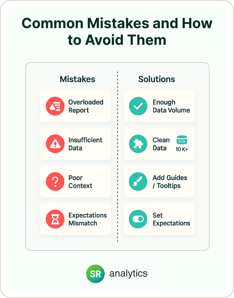
Overloading Power BI Reports with AI Visuals
The problem is that adding every Power BI AI visual to one report page creates performance nightmares. Each AI visual requires complex calculations, and users get overwhelmed.
The solution involves:
Limit to 2-3 AI visuals: Keep AI based visuals in Power BI to 2-3 per report page maximum.
Separate analytical pages: Create dedicated analysis sections away from operational Power BI dashboards.
Use bookmarks strategically: Show/hide Power BI AI visuals as needed rather than loading everything at once.
One client reduced report load time from 45 seconds to 8 seconds by moving Power BI AI visuals to dedicated analysis pages. That’s the difference between user adoption and abandonment.
Using Power BI AI Visuals with Insufficient Data
Key Influencers with 500 rows produce unreliable results. Anomaly Detection with 20 data points is meaningless. The solution is straightforward but critical:
Key Influencers: Minimum 1,000 rows, ideally 10,000+ for reliable statistical analysis.
Anomaly Detection: At least 30 time periods to establish meaningful patterns.
Q&A: Complete data with minimal nulls to avoid confusing or incomplete responses.
Ignoring Data Quality in Power BI Dashboards
AI based visuals in Power BI amplify data issues. Inconsistent categories, missing relationships, and dirty data create confusing or wrong insights.
Standardize categories before analysis, fix relationships in the model (not in visuals), and clean data at the source when possible.
Here’s a perfect example: a company had “USA”, “United States”, and “US” in their country field. Key Influencers treated these as three separate countries, completely skewing results in their Power BI report.
Poor Visual Context
Users don’t understand what Power BI AI visuals are showing or how to interpret results. The solution involves adding clear titles explaining the visual’s purpose, including brief interpretation guides, using tooltips for technical terms, and providing examples of insights to look for.
Not Setting Expectations
Users expect instant results, but AI based visuals in Power BI need processing time. Communicate that Power BI AI visuals take 5-15 seconds, add loading indicators, explain the value of waiting, and consider pre-aggregating data for faster results.
Real-World Success Stories and ROI
Let me share concrete results from companies using these Power BI new features and AI based visuals in Power BI.
Walmart: Transforming Finance at Scale
Walmart faced a massive challenge with 10,500 stores generating trillions of transactions, Excel-based reporting creating inconsistencies, and finance teams needing transaction-level insights.
Their AI implementation included Key Influencers analyzing profitability drivers in Power BI dashboards, Q&A enabling natural language financial queries, and Anomaly Detection for unusual store performance.
The results speak for themselves: they eliminated spreadsheet inconsistencies, enabled drill-down to individual transactions in Power BI reports, democratized financial insights across teams, and identified millions in cost savings through AI-discovered patterns.
T-Mobile: Scaling Analytics Excellence
T-Mobile needed to handle hundreds of use cases across the organization with real-time insights at scale while maintaining row-level security requirements.
Their AI implementation featured automated anomaly detection for network performance, Smart Narratives for executive reporting in Power BI dashboards, and Q&A visuals for store manager self-service.
The quantified results were remarkable: 11x increase in real-time request processing, 12x improvement in processing time, error rate reduced from 7% to 0%, and thousands of hours saved monthly using Power BI AI visuals.
Manufacturing Client: Predictive Quality Control
This implementation included Anomaly Detection on production metrics, Key Influencers for defect analysis, and Decomposition Tree for root cause investigation.
The business impact was substantial: 47% reduction in defect rates, $2.3M annual savings from prevented issues, 60% faster problem resolution, and a shift from reactive to proactive quality management.
Key ROI metrics across implementations show:
- 18-25% productivity improvement across analysis teams
- 30% reduction in analysis time for common business questions
- $10 vs $70 per user compared to competitors like Tableau
- 80% reduction in IT support requests due to self-service capabilities
Performance Optimization Strategies for Power BI AI Visuals
Making your AI based visuals in Power BI lightning fast requires specific techniques I’ve refined over years of implementations.
Data Model Optimization
Data model optimization starts with using star schema design because Power BI AI visuals perform best with proper star schema design. Flatten complex snowflake schemas where possible.
My implementation tip is to create a dedicated analytical model optimized for Power BI new features separate from operational reports.
Query Optimization Techniques
Query optimization involves pre-aggregating when possible. Create summary tables for common analysis levels, use Power BI’s aggregation features, and balance detail needs with performance.
For example, instead of analyzing 50 million transactions in your Power BI dashboard, create daily summaries for trend analysis.
Capacity Planning
Capacity planning depends on choosing the right license:
Pro ($10/user): Handles basic Power BI AI visuals for small teams.
Premium Per User ($20/user): Provides better performance for power users.
Premium Capacity (P1+): Delivers fastest processing with Copilot access for enterprise needs.
Reserve 20% of Premium capacity memory for AI workloads to prevent resource contention.
Best Practices Checklist
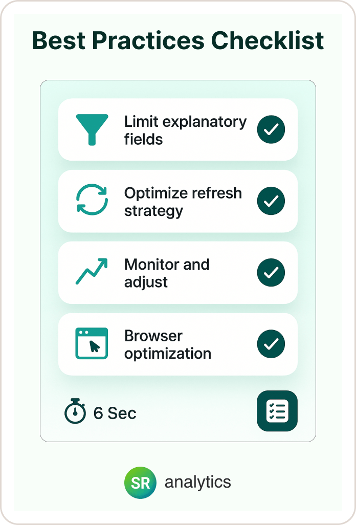
Following best practices makes an enormous difference:
Limit explanatory fields: Keep Key Influencers to 10-15 fields maximum and remove ID fields and high-cardinality dimensions.
Optimize refresh strategy: Use import mode for AI based visuals in Power BI when possible, DirectQuery only when real-time is critical.
Monitor and adjust: Use Performance Analyzer monthly, track query times in usage metrics, and adjust based on user patterns.
Browser optimization: Clear cache regularly, use Edge or Chrome for best performance, and avoid Internet Explorer completely.
One financial services client reduced their Key Influencers load time from 32 seconds to 6 seconds through these optimizations, making the difference between adoption success and user abandonment.
Future-Proofing Your Power BI Reports
Staying ahead requires understanding Microsoft’s AI roadmap for Power BI new features.
Coming in 2025, we’ll see the Copilot Standalone Experience (May 2025) featuring cross-report AI analysis, natural language DAX generation, and automated insight discovery.
Preparation steps include standardizing naming conventions now, documenting business logic in descriptions, and creating consistent data models across Power BI reports.
Microsoft Fabric integration represents the future of Power BI dashboards through unified analytics. Prepare by understanding OneLake concepts, planning for Direct Lake mode, and considering Fabric capacity.
My AI evolution strategy looks like this:
Near-term (6 months): Master current Power BI AI visuals, build AI-ready data models, and train users on natural language queries.
Medium-term (12 months): Integrate Copilot capabilities, explore Azure AI connections, and develop AI governance policies.
Long-term (24 months): Implement autonomous analytics agents, multi-modal interactions, and predictive optimization.
Action item: start building AI-friendly data models now. Clean data, clear naming, and proper relationships become even more critical as AI based visuals in Power BI expand.
Your 30-Day Implementation Plan
Week 1 focuses on auditing current data models, identifying your first Power BI AI visual use case, and cleaning and preparing data.
Week 2 involves implementing one AI based visual in Power BI, testing with power users, and documenting lessons learned.
Week 3 includes optimizing based on feedback, adding a second Power BI AI visual, and creating user guides.
Week 4 covers rolling out to a broader audience, monitoring performance metrics in your Power BI dashboard, and planning next implementations.
Remember: start small, measure impact, and scale what works. Companies achieving 25% productivity gains didn’t transform overnight – they implemented them systematically.
Your next step is simple: choose one Power BI report and one AI based visual in Power BI. Follow this guide, and within 30 days, you’ll deliver insights that transform how your organization makes decisions.
Ready to take your Power BI implementation to the next level? Whether you’re just starting with AI visuals or looking to optimize enterprise-scale reports, having the right partner can make all the difference. If you want expert guidance that goes beyond the basics and delivers measurable business value, consider leveraging a Power BI consulting service. A dedicated consulting team will help you avoid common pitfalls, maximize ROI from Microsoft’s latest AI features, and create Power BI dashboards that drive better decisions—fast. Start transforming your analytics today with the support of seasoned professionals.


