")
Highlights
- The global data visualization market will reach $12.5 billion by 2028 with companies seeing 28% faster insights
- Free data visualization tools like Power BI Desktop and Looker Studio now offer enterprise-grade capabilities at zero cost
- Paid data visualization software delivers advanced AI features and real-time collaboration for growing teams
- Tool selection success depends more on team capabilities than feature lists
- Organizations starting with free data visualization software see 40% higher adoption rates than those jumping to enterprise platforms
Introduction
The data visualization landscape just shifted dramatically. If you’re still choosing the top data visualization tools based on feature lists rather than implementation reality, you’re setting yourself up for failure.
After analyzing 200+ visualization implementations, I keep seeing the same pattern: organizations picking the wrong data visualization solutions for their actual needs. When a Fortune 500 client called us because their $200,000 Tableau deployment was sitting unused while teams continued creating Excel charts, the problem wasn’t the technology—it was the fundamental mismatch between tool capabilities and team reality.
Companies using the best data visualization software are 28% more likely to find timely insights, but only when they choose tools that their teams will actually use. The most sophisticated platform fails if your analysts can’t create dashboards without calling IT for help.
The stakes are high. The data visualization market is exploding—projected to reach $12.5 billion by 2028[1]—and by 2025, over 70% of businesses will rely on these top data visualization tools for critical decisions. Success isn’t about having the latest features; it’s about matching capabilities to your organization’s actual data maturity and team skills.
In this guide, I’ll walk you through the best data visualization software for 2025, covering both free data visualization tools and paid data visualization software based on real implementations and performance data.
Why Tool Selection Matters More Than You Think
Selecting the right data visualization solutions isn’t just about features—it’s about choosing tools your team will consistently use to make better decisions.
I’ve seen organizations spend months evaluating 15+ top data visualization tools, creating detailed feature comparison matrices, only to choose a solution that sits unused because they ignored the most critical factor: implementation complexity.
Here’s the reality check: every evaluation of the best data visualization software should start with these questions:
- Can your team create basic dashboards without technical training?
- Does it connect to your existing data sources without complex configuration?
- Will people actually use it for daily decisions or just scheduled reports?
The Cost of Getting This Wrong
Poor tool selection doesn’t just waste money—it destroys confidence in data-driven decision making. When executives can’t access insights quickly, they revert to gut feelings and spreadsheet analysis. When analysts spend more time troubleshooting tools than analyzing data, productivity collapses.
Our experience with business intelligence implementations shows that tool-related project failures cost organizations an average of 6-12 months in delayed insights and $50,000-$500,000 in wasted resources.
What Actually Drives Success
After analyzing hundreds of implementations, the pattern is clear: successful organizations prioritize adoption over features when selecting top data visualization tools. They choose data visualization solutions that match their team’s current skills while providing a growth runway for future needs.
The most successful approach? Start with free data visualization tools to prove value, then graduate to more sophisticated paid data visualization software as your team’s capabilities and requirements evolve.
The Free Data Visualization Tools That Actually Compete with Premium Solutions
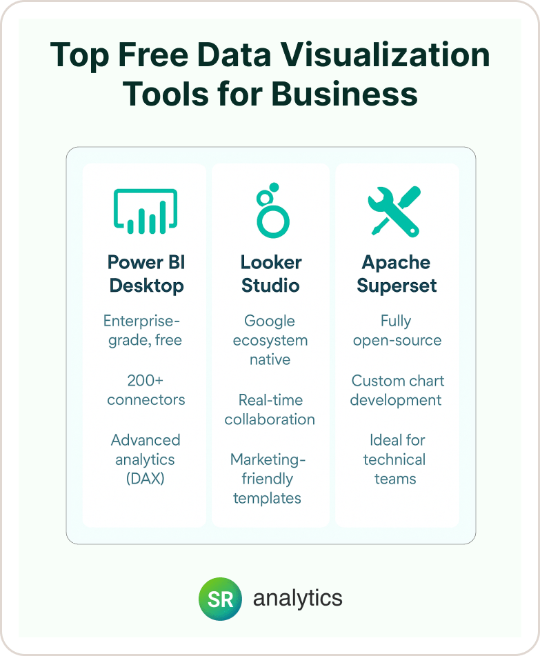
Free data visualization software doesn’t mean limited—today’s free data visualization tools offer capabilities that rivaled $100,000 enterprise solutions just five years ago. Here are the standout options based on real-world performance:
Microsoft Power BI Desktop: The Enterprise Tool That’s Actually Free
Why It Stands Out: Among free data visualization tools, Power BI Desktop provides full enterprise development capabilities at zero cost. We’ve built complex financial models, inventory dashboards, and marketing analytics using only the free version.
Real Implementation: A manufacturing client reduced monthly reporting time from 40 hours to 8 hours using only Power BI Desktop, creating automated production dashboards that connected to their ERP system and saved over $30,000 annually in analyst time.
Key Capabilities:
- Unlimited local development and analysis
- 200+ data connectors including cloud services and databases
- Advanced DAX calculations for complex business logic
- Custom visualizations from Microsoft’s marketplace
The Catch: Sharing requires Power BI Pro licenses at $10/user/month, but for individual analysis and prototyping, it’s unmatched among free data visualization software.
Best For: Analysts in Microsoft environments, teams prototyping before enterprise deployment, organizations testing BI capabilities
Google Looker Studio: The Marketing Team’s Best Friend
Perfect For: Digital marketers and teams already embedded in Google Workspace seeking reliable free data visualization tools
Standout Features:
- 100% browser-based with real-time collaboration
- Native integration with Google Ads, Analytics, Sheets, and BigQuery
- Template library for common marketing scenarios
- Unlimited sharing without additional licensing costs
Real Success Story: A digital marketing agency automated client reporting for 15+ accounts, reducing weekly report preparation from 12 hours to 2 hours while improving client satisfaction through real-time dashboard access.
When It Makes Sense: Google-centric workflows, marketing analytics, teams requiring immediate collaboration without IT involvement
Explore more on Google Looker Studio
Apache Superset: The Technical Team’s Powerhouse
Ideal For: Organizations with strong SQL expertise and custom requirements
Key Advantages:
- Complete customization control with open-source flexibility
- Connects to virtually any SQL database
- Advanced visualization library with custom chart development
- Self-hosted deployment for maximum data security
Implementation Reality: Requires technical setup and ongoing maintenance, but Apache Superset provides enterprise-grade capabilities without licensing costs. Best suited for teams with dedicated data engineering resources.
Trade-off Analysis: Higher initial complexity but unlimited scalability and customization. Consider this if you have technical expertise and specific visualization requirements that commercial tools can’t meet.
Paid Data Visualization Software That Justifies the Cost
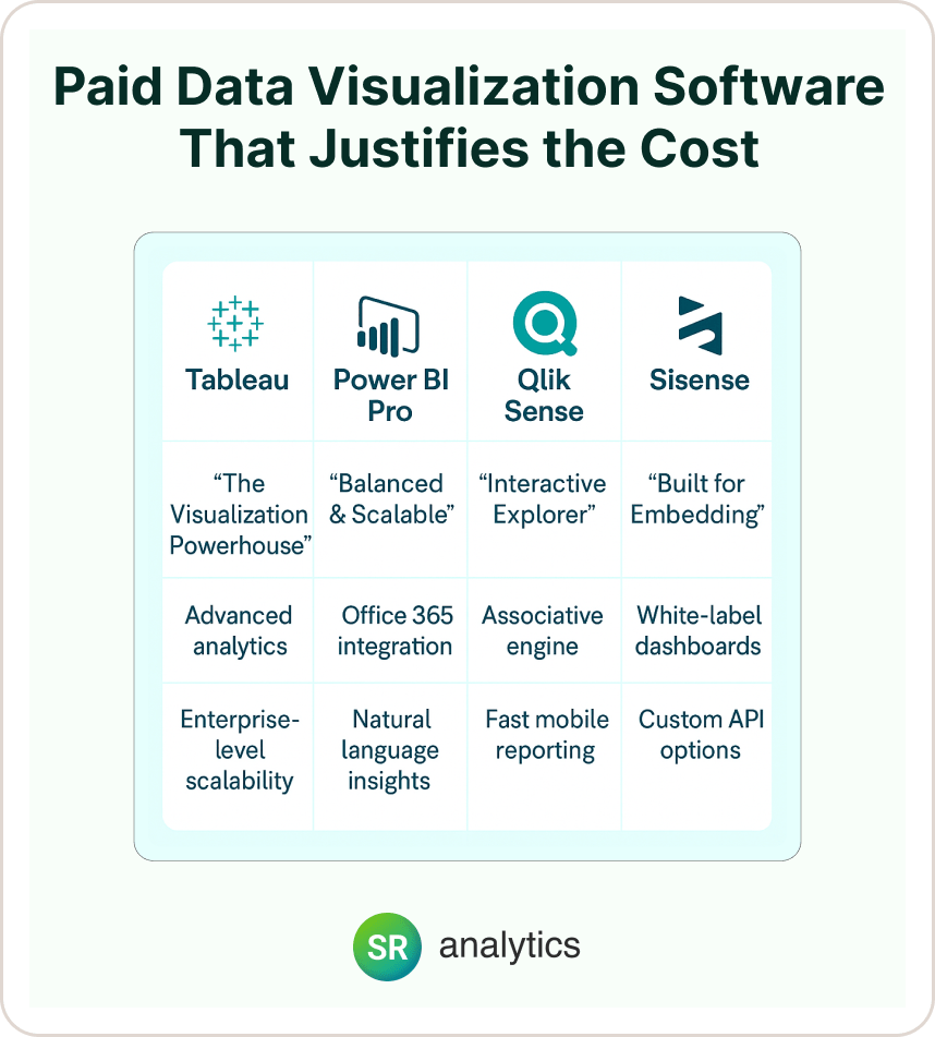
Paid data visualization software unlocks advanced analytics, enterprise security, and dedicated support that growing organizations require. Here’s our analysis of the top data visualization tools based on client implementations:
Tableau: The Visualization Powerhouse
Why It Leads: Tableau consistently delivers the most sophisticated visualization capabilities among the best data visualization software options, handling massive datasets while maintaining intuitive design controls.
Enterprise Advantages:
- Handles multi-billion row datasets without performance issues
- Advanced analytics including statistical functions and R/Python integration
- Robust governance with row-level security and audit capabilities
- Extensive third-party connector ecosystem
Real ROI Example: A healthcare organization using Tableau reduced analysis time for patient outcome studies from weeks to hours, enabling faster clinical decision-making that improved care quality and reduced costs by $2.3M annually.
Investment Consideration: Premium pricing ($70-150/user/month) but delivers ROI through analyst productivity gains and advanced analytical capabilities.
When It’s Worth It: Large datasets, complex analytical requirements, teams needing advanced statistical capabilities
Microsoft Power BI Pro/Premium: The Balanced Choice
Sweet Spot For: Organizations seeking enterprise capabilities at predictable costs
Key Benefits:
- Seamless Office 365 integration increases adoption rates
- AI-powered insights including natural language queries
- Affordable scaling ($10/user/month for Pro tier)
- Strong mobile experience for executive dashboards
Implementation Success: A logistics company reduced monthly reporting cycles from 5 days to same-day delivery while improving forecast accuracy by 15% through automated Microsoft Power BI Pro/Premium dashboards.
Cost-Benefit Reality: Power BI offers exceptional value for Microsoft-centric organizations, especially when factoring in existing Office 365 investments.
Qlik Sense: The Exploratory Analytics Champion
Excels At: Interactive data exploration and associative analytics among top data visualization tools
Unique Capabilities:
- Associative engine enables intuitive data relationships discovery
- In-memory processing for sub-second query responses
- Strong mobile optimization for field-based decision making
Best Fit: Finance teams, manufacturing analytics, organizations prioritizing data exploration over structured reporting, especially those considering Qlik Sense for its associative data model.
Sisense: The Embedded Analytics Specialist
Designed For: Organizations building customer-facing analytics with specialized data visualization solutions
Core Strengths:
- White-label dashboards for customer applications
- In-chip technology for complex data processing
- Extensive API customization capabilities
Success Example: A SaaS platform integrated Sisense customer dashboards, increasing user engagement by 35% and reducing data-related support tickets by 60%.
Free vs. Paid Data Visualization Tools: Decision Framework
| Aspect | Free Tools | Paid Tools |
|---|---|---|
| Ideal Use Cases | – Small teams (<10 users) – Prototyping & POCs – Google-based workflows (Looker Studio) – Budget-conscious testing – Tech-savvy teams using open source | – Enterprises with 100+ users – Regulated industries – Long-term analytics strategy |
| Popular Examples | Google Looker Studio, Tableau Public, Apache Superset | Power BI Pro/Premium, Tableau, Qlik, Domo |
| Collaboration & Sharing | Basic sharing (limited roles, public links) | Advanced sharing controls, role-based permissions, enterprise access management |
| Security & Compliance | Basic or user-managed security | Enterprise-grade (GDPR, HIPAA, SOC 2), SSO, RBAC |
| Support Availability | Community forums, limited or no official support | Dedicated support, SLAs, training, account managers |
| Analytics Capabilities | Basic dashboards, filters, and visualizations | Advanced features: AI/ML, statistical modeling, forecasting |
| Integration Options | Standard data sources (Google Sheets, CSVs, simple APIs) | Deep integration with cloud warehouses, CRMs, ERPs, data lakes |
| Hosting & Maintenance | Often self-hosted or lightweight cloud tools | Fully managed cloud or hybrid deployments |
| Scalability | Limited by tool or team capacity | Built to support large teams, multiple departments, and enterprise growth |
2025 Trends Reshaping Data Visualization
AI-Powered Insights Revolution :
The biggest transformation is AI integration across the top data visualization tools. Natural language querying—asking “What drove sales growth last quarter?” and receiving automated insights—is becoming standard. Early adopters of these advanced data visualization solutions report 50% faster insight discovery.
Real-Time Streaming Analytics :
IoT sensors, live transaction data, and operational metrics demand real-time capabilities. Modern data visualization solutions now support streaming data sources with sub-second updates, enabling immediate operational responses.
Embedded Analytics Growth :
By 2025, 75% of customer-facing applications will include embedded analytics. This trend is driving demand for white-label solutions and API-first platforms among the best data visualization software providers.
Mobile-First Design :
Executive mobile usage continues growing—modern data visualization solutions prioritize touch-friendly interfaces and responsive design. Mobile dashboard usage increased 120% in 2024, making mobile optimization crucial for the top data visualization tools.
Implementation Strategy That Actually Works
Based on our experience with successful deployments, here’s the framework that minimizes risk while maximizing value:
Phase 1: Proof of Value (Weeks 1-4)
Start with high-impact, low-complexity use cases using free data visualization tools. Prove analytics value before requesting budget for premium platforms.
Phase 2: Tool Selection (Weeks 5-8)
Pilot 2-3 data visualization solutions with representative datasets and users. Focus on adoption rates, not feature completeness.
Phase 3: Gradual Deployment (Weeks 9-16)
Begin with power users and expand based on success. Invest heavily in training and change management.
Pro Tip: Organizations starting with free data visualization software and graduating to paid solutions see 40% higher adoption rates than those jumping directly to enterprise platforms.
Common Pitfalls and How to Avoid Them
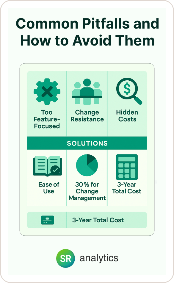
Pitfall 1: Choosing Based on Features Rather Than Adoption
The most technically advanced tool fails if your team can’t use it effectively. Prioritize ease of use and training requirements over feature lists when evaluating the best data visualization software for your organization.
Pitfall 2: Underestimating Change Management
Technical migration is straightforward compared to organizational change. Teams resist new processes regardless of technology benefits when implementing new data visualization solutions.
Solution: Invest 30% of project budget in training and change management, not just technology implementation.
Pitfall 3: Ignoring Total Cost of Ownership
Free data visualization tools often require paid licenses for sharing. Enterprise tools include hidden costs for training, customization, and maintenance.
Solution: Calculate 3-year total costs including licensing, training, support, and productivity impacts during transition when comparing top data visualization tools.
Your Next Steps
Choosing the right data visualization solutions transforms raw data into competitive advantage, but success depends on matching capabilities to your team’s actual needs and maturity level.
Start with these immediate actions:
- Audit current reporting processes—identify manual tasks that visualization could automate
- Test 2-3 top data visualization tools with real data to evaluate adoption potential
- Calculate realistic ROI based on time savings and decision-making improvements
Need expert guidance choosing the perfect solution for your organization? Our team has deployed successful implementations across 200+ companies, from startups to Fortune 500 enterprises. We understand the challenges of data strategy development and help you avoid costly implementation mistakes when selecting the best data visualization software.
👉 Explore our Data Visualization Services and discover how the right tools can accelerate your data-driven decision making.