
Introduction: Why You Need to See Your Data
Ever feel like you’re swimming in spreadsheets but still can’t find the answers you need?
You’re not alone. Whether you’re running a retail shop, managing a startup, or scaling your operations, data is everywhere—sales, marketing, inventory, customer feedback. But here’s the thing: raw data is just noise until you make sense of it.
Many small business owners today feel overwhelmed by data, from spreadsheets of sales numbers to website analytics. In an era where companies are “drowning in data,” data visualization offers a lifeline by turning raw numbers into visual insights that anyone can understand.
Demand for data skills is rising every year, and businesses of all sizes are expected to make data-driven decisions. This article serves as a beginner-friendly data visualization guide for busy SMB leaders.
What Is Data Visualization?
Data visualization is the graphical representation of information and data. In other words, it means taking data (often lots of numbers or text) and displaying it in a visual format—such as a chart, graph, map, or infographic—so that patterns and insights become easy to see.
For example, instead of poring over a spreadsheet of sales figures, you could visualize that data in a line chart to instantly spot trends over time. The goal of data visualization is to make complex data more accessible and understandable.
Importantly, data visualization isn’t just for data scientists; it’s meant for everyone. A good visualization helps non-technical audiences grasp insights without confusion. It “turns data into stories” and adds meaning to otherwise bland numbers. For instance, a simple bar graph can tell the story of which products are top sellers this quarter at a glance.
Humans are visual creatures. We process visuals 60,000 times faster than text. A good chart can help you see what a spreadsheet can’t—at least, not without squinting.
Example: In 1869, engineer Charles Minard created a stunning map showing Napoleon’s Russian campaign losses. It visualized troop numbers, geography, time, and weather—all in one view. That one visual told a multi-dimensional story better than any paragraph could. See it here.
Why Is Data Visualization Important for Businesses?

In business, data visualization is vital because it enables faster and smarter decisions. Humans can process visual information much quicker than raw spreadsheets; studies show we absorb visual data 60,000 times faster than text in some cases.
Here are key benefits and advantages of data visualization in a business context:
- Quick Insights & Better Decisions: Charts and dashboards let you absorb information at a glance, unveiling trends or problems immediately. This rapid insight means you can make decisions faster and with greater confidence.
- Identifying Patterns and Outliers: Visualization helps highlight patterns, correlations, and outliers that might be hidden in raw data. Trends become obvious – such as seasonal peaks in sales – and anomalies (like an expense spike) stand out for investigation.
- Improved Decision-Making & Strategy: By seeing data visually, business teams can better understand how different factors relate. This leads to more informed, data-driven strategies. Visualizations make it easier to spot connections and predict outcomes, enhancing strategic planning.
- Enhanced Communication & Buy-In: Pictures speak louder than rows of numbers. Visual data is universal: it bridges gaps between technical experts and business stakeholders. When you present a clear graph or infographic, it’s more memorable and persuasive than a dense report. Visual storytelling keeps your audience’s interest and can spur productive discussions.
- Accessibility for Diverse Audiences: For small businesses, you might not have a full-time analyst to interpret data for everyone. Good data visualization allows anyone on the team to glean insights, not just the “numbers people.” Even a non-technical founder can read a well-designed chart and understand the business health.
- Motivation and Engagement: Seeing data displayed in real time can motivate teams. It provides immediate feedback and can gamify performance. Moreover, visualizing progress toward goals builds urgency and engagement across the company.
As an example of these benefits in action, TechTarget notes that organizations using data visualization can absorb information quickly, share insights easily, and act on findings with greater speed. Visual tools essentially turn your business data into a clear narrative – one that can highlight what’s working, what’s not, and what to do next.
Advantages of Data Visualization for Business Owners

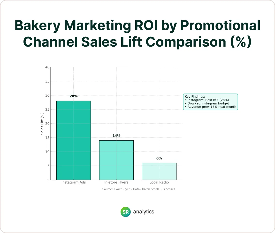
Real-Life Example: A Bakery Boosts ROI with a Bar Chart
A local bakery ran three types of promotions: Instagram ads, in-store flyers, and local radio. They tracked sales but had no idea which promo worked best—until they visualized the data.
They created a bar chart comparing sales lift by channel. Instagram outperformed everything.
Result? They doubled their Instagram budget, ditched radio, and grew revenue 18% the next month.
Common Data Visualization Types & Examples
What does data visualization actually look like in practice? In this section, we’ll highlight some common visualization techniques and how small businesses might use them.
Including examples and use cases not only educates beginners (fulfilling the “data visualization guide” aspect) but also incorporates the keyword “data visualization for SME businesses” by showing scenarios relevant to smaller companies.
👉 Charts and Graphs: The bread-and-butter of data viz. Line charts show trends over time – for instance, a line graph of monthly sales can reveal seasonal patterns or growth trajectories. Bar charts compare categories side by side; a bar chart of product lines can instantly highlight your best sellers vs. weaker products.
Pie charts depict parts of a whole, useful for visualizing an expense budget breakdown by category. Scatter plots help find relationships between two variables. These basic charts are simple but powerful for any business to find answers in their data.
👉 Maps and Geographical Visualizations: If your business operates in different regions or serves customers in various areas, maps can be invaluable. A choropleth map (color-coded map) might show which regions generate the most sales or have the highest customer densities.
For example, a local retail chain could visualize revenue by county on a map to identify geographic expansion opportunities. Another example: public health officials use maps to track disease outbreaks, which is analogous to a franchise owner mapping incidents of store issues or customer feedback by location to spot regional trends.
👉 Dashboards: A dashboard is a collection of visuals (charts, gauges, tables) on one screen, often updated in real time. Small businesses use dashboards to monitor key performance indicators (KPIs) at a glance.
For instance, a sales dashboard might combine a line chart of monthly revenue, a bar chart of sales by product, and a gauge showing progress toward the quarterly goal. Dashboards are interactive and can pull data from different sources in one view.
The advantage is real-time monitoring for immediate response – you can log in each morning and quickly see if anything is off track, instead of waiting for end-of-month reports.
Many BI tools (like Tableau, Power BI, or Google’s Looker Studio) offer dashboard capabilities that are very useful for SMEs to keep a pulse on their business without manual effort.
👉 Interactive Infographics: Infographics combine data visuals with design and narrative text. While not every small business will create their own infographics, they’re useful for marketing and reports.
For example, you might present your annual results or a customer survey in an infographic to share on your blog or social media – turning numbers into a compelling visual story for your audience.
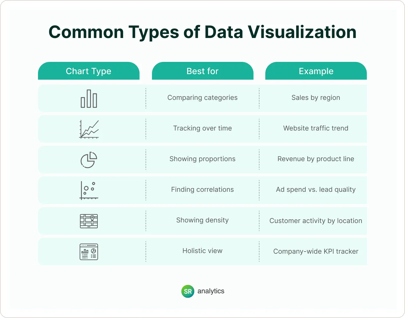
Pro Tip: Use line charts for trends, bar charts for comparisons, and pie charts only when showing a small number of categories. Too many slices = confusion.
Data Visualization in Business Intelligence (BI)
If you’re already using BI tools like Power BI, Tableau, or Looker, you’re halfway there.
Data visualization is the beating heart of BI—making reports and analytics interactive and digestible. Instead of static reports, BI dashboards update in real time and let users drill down.
Data Visualization Best Practices
Knowing why and what to visualize is half the battle – the other half is doing it correctly. Poorly designed visuals can mislead or confuse, so it’s important to follow some best practices. This section will cover “data visualization best practices” to ensure readers create effective, clear visuals.
Major guides emphasize that successful data viz requires thoughtful design and planning. Here are some essential tips:
- Start with a Clear Purpose: Clarify what question you’re trying to answer or what story you want to tell with your data. Every chart should have a focused message.
- Know Your Audience: Tailor the visualization’s complexity and detail to who will view it. An internal analyst might appreciate a dense chart with drill-down capabilities, but a busy CEO or a client might need a high-level, simplified graphic.
- Keep it Simple and Focused: Avoid clutter – simplicity is key to clarity. Each extra color, line, or data series can increase cognitive load. It’s tempting to cram lots of information into one chart, but that usually backfires. Instead, highlight the most important data points that serve your purpose.
- Choose the Right Visualization Type: Match your data and message to an appropriate visual. If showing parts of a whole, use a pie or stacked bar; for trends, use a line; for ranking or comparison, use bars; for correlation, use a scatter plot, etc.
- Provide Context with Labels and Scales: Always include clear labels, titles, and legends so the viewer knows what they’re looking at. Define your axes, include units, and if necessary, brief notes or captions.
- Use Color Intentionally: Color is a powerful visual tool – use it strategically. Consistent coloring helps reinforce understanding. Avoid using too many colors; instead, use a highlight color to draw attention to key data and muted tones for background or less important data.
- Ensure Accuracy and Integrity: Double-check your data and the way it’s presented. A beautiful chart means nothing if the underlying data is wrong or outdated. Likewise, avoid distortions – for example, don’t truncate axes or use misleading proportions that skew the visual message. Make sure your visualization tells the truth about the data.
- Make it Interactive (If Appropriate): Interactive visuals can engage users and let them explore the data on their own terms. This isn’t always necessary for a static report or simple explanatory graphic, but if you’re using a tool like an interactive dashboard, consider adding features like tooltips or simple filters.
- Test and Refine: After creating a visualization, get feedback. Show it to a colleague and ask if the main message is clear. You might find you need to adjust a label, remove a distracting element, or clarify a color choice. Iterating will improve the final quality.
Following these data visualization best practices ensures are not just pretty pictures, but effective business tools. As a result, you’ll avoid common pitfalls of bad data viz (like confusion, misinterpretation or information overload) and instead create charts that influence decisions in a positive way.
Data Visualization for SME Businesses
Think this is just for enterprise? Nope. SMEs and startups can benefit just as much (sometimes more!).
Why? Smaller teams need lean, actionable insights. No room for bloated reports.
Here’s how SMEs can apply it:
- Marketing: Visualize campaign performance to reallocate budget fast
- Sales: Track reps, leads, and conversions in one dashboard
- Operations: Monitor inventory or shipping delays visually
- Finance: Compare forecasts vs. actuals
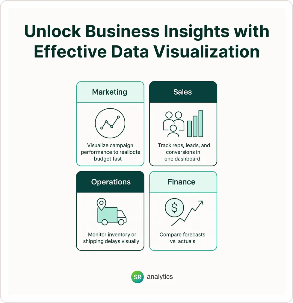
Tool tip: Use Power BI Desktop (free) or Google Looker Studio to build dashboards using Excel or Google Sheets data.
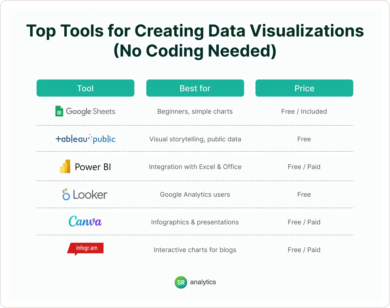
Top Tools for Creating Data Visualizations (No Coding Needed)
Implementing a Data Visualization Strategy in Your Small Business
Having great charts is useful, but to truly reap the benefits, you should embed data visualization into your business decision-making process. Let’s discuss how to develop a data visualization strategy tailored for small and mid-sized businesses.
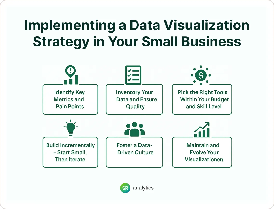
High-ranking content often talks about tools and broad use, but here we focus on practical steps and considerations for an SMB to get started, which is a nuance often missing in generic articles.
1) Identify Key Metrics and Pain Points:
Begin by asking, “What business questions do we need answers to?” and “Which metrics matter most to our success?”.
For example, a retailer might focus on daily sales, foot traffic, and inventory turnover; a SaaS startup might track monthly recurring revenue and churn rate. Pinpoint the areas where better visualization could drive insights – is it marketing performance, financial trends, operational efficiency, customer behavior?
By zeroing in on high-impact metrics (KPIs), you ensure your visualization efforts are aligned with strategic goals. This also prevents wasting time creating visuals for data that isn’t actionable.
2) Inventory Your Data and Ensure Quality:
Figure out where your relevant data currently lives (Excel sheets, accounting software, Google Analytics, POS systems, etc.). Clean and organize that data so it’s accurate and up-to-date – “clean, well-prepared data” is the foundation of any good visualization.
Small businesses often have data siloed in different places, so you might need to consolidate it. For instance, you may export data from a sales system and a marketing platform to combine in a single view.
There are affordable tools and even free scripts to help merge data sources if needed. Remember, garbage in, garbage out: a good strategy ensures you’re visualizing reliable data.
3) Pick the Right Tools Within Your Budget and Skill Level:
The good news is you don’t need a huge budget to start visualizing data. Many user-friendly and cost-effective data visualization tools are available. If you’re just starting, even Excel or Google Sheets can create basic charts and are essentially free .
For interactive dashboards and more sophisticated visuals, consider tools like Tableau, Microsoft Power BI, or Google Data Studio (Looker Studio), which offer free versions or affordable tiers. Many SMBs start with Tableau Public (free) or Power BI Desktop (low cost) to build initial dashboards.
4) Build Incrementally – Start Small, Then Iterate:
You don’t have to visualize everything at once. In fact, it’s wise to start with one or two high-value charts or a basic dashboard addressing your top priority. Implement that, use it, and gather feedback.
For example, you might first create a sales dashboard. Once that’s running well and team members are using it, you could add a dashboard for marketing metrics. Starting small reduces complexity and allows quick wins, which can build buy-in.
5) Foster a Data-Driven Culture:
Encourage your team to use these visuals in regular decision-making. This might mean reviewing the dashboard in weekly meetings or setting aside time each month to delve into the charts for strategic planning.
Lead by example: if business owners and managers actively reference data visualizations when making decisions (“According to our dashboard, Product A outsold Product B by 30% last quarter, so let’s increase inventory for A”), it sends a message that data matters.
Over time, as people trust the data, you might find decisions are made more quickly and with less debate, because the visuals have created a single source of truth that everyone can see.
6) Maintain and Evolve Your Visualizations:
A data visualization strategy isn’t a one-and-done project. Assign responsibility for maintaining the dashboards – ensuring data feeds are working, updating charts as metrics or goals change, and so on.
Periodically, revisit your visuals to see if they’re still relevant. Your business will evolve, and your data needs might too; be ready to tweak or overhaul dashboards to align with new questions or objectives. Also, keep an eye on performance: if a dashboard is loading slowly due to growing data volumes, you may need to optimize it or upgrade your tools.
Tools and Software: Finding the Right Solution
As mentioned, there’s a wide array of data visualization tools on the market – the best one for you depends on your needs and resources. Here’s a quick overview of options for small and mid-sized businesses:
👉 Spreadsheet Tools (Excel, Google Sheets): Ideal for beginners, these allow you to create bar, line, pie charts, etc., with your data. Most people are already familiar with them.
While not as powerful for interactive or large-scale visuals, spreadsheets are great for quick charts and are essentially free (Google Sheets) or already available in many office setups. Excel is still “a popular tool for data visualization” in businesses, and you can gradually move up from there.
👉 Business Intelligence (BI) Tools: These include Tableau, Microsoft Power BI, Qlik Sense, Looker Studio (Google Data Studio), and others. They connect to various data sources and let you create interactive dashboards and reports. Many have drag-and-drop interfaces.
For example, Tableau is known for its powerful visuals and has a free public version, and Power BI is very cost-effective (and free for single-user desktop version). These tools are great once you have multiple data streams and need automated, shareable dashboards.
Forbes’s list of small-business-friendly data viz tools includes several of these, highlighting their usefulness for companies with limited IT support.
👉 Visualization Libraries and Code (Advanced): If you or someone on your team has programming skills, libraries like D3.js (JavaScript) or Matplotlib/Seaborn (Python) allow ultimate customization. However, for most small businesses, this level of custom coding isn’t necessary – it’s mentioned for completeness, but likely not the first step in your journey.
👉 Industry-Specific or All-in-One Platforms: Some tools cater to specific domains (e.g., marketing analytics platforms that include visualization) or offer an all-in-one data pipeline plus viz.
For instance, if you’re heavily into e-commerce, your e-commerce platform or Google Analytics might have built-in visualization features for sales funnels, etc. Before adopting a new tool, check what you already have – many software tools (CRM, accounting software) provide dashboards or charting capabilities that you might leverage with no extra cost.
Final Thoughts: Make Data Work for You
In 2025, businesses have more data than ever—but only those who see their data clearly will win.
Data visualization is no longer optional. Whether you’re a founder, marketing lead, or operations manager, you need to know what’s happening in real time and why. The key takeaway is that data visualization makes data approachable and actionable.
Instead of feeling overwhelmed by numbers, you and your team can interact with information in a natural, visual way – whether it’s identifying your best-selling product line this year, pinpointing inefficiencies in a process flow, or convincing a potential investor with a compelling data story.
Start simple. Pick one KPI. Build one chart. Share it with your team. That’s how a data-driven culture begins.


