Highlights:
- 67% of the global workforce now has access to business intelligence tools
- Organizations with high BI adoption are 5x more likely to make faster decisions
- Business intelligence market growing from $31.98 billion to $63.20 billion by 2032
- Power BI KPIs reduce reporting time by 60% compared to traditional spreadsheet methods
- Strategic KPI selection framework: Focus on 5-7 metrics maximum per dashboard
- Advanced features like Power BI Goals enable real-time scorecard management
- Step-by-step implementation guide from data setup to advanced automation
Ever stared at a dashboard full of numbers and felt overwhelmed? You’re not alone. Most businesses track dozens of metrics, but only a handful actually matter for making real decisions.
That’s where Power BI KPIs come in. Key Performance Indicators aren’t just fancy business terms – they’re your company’s vital signs. And when you build them right in Power BI, they become powerful tools that show you exactly where your business stands at any moment.
This guide walks you through everything you need to know about implementing effective Power BI KPIs. From picking the right kpi metrics to building dashboards that actually get used, we’ll cover the practical stuff that makes a difference.
What Makes a KPI Worth Tracking
A kpi in power bi is simply a metric that tells you if you’re winning or losing at something important. But here’s the thing – not every number deserves to be a KPI.
Good business kpis share three characteristics:
- They connect to your goals: Every KPI should link directly to a business objective
- You can influence them: If you can’t change it, don’t track it as a KPI
- They trigger action: When a KPI changes, someone should know what to do next
Think about a retail store. Revenue is important, but “average transaction value” might be a better KPI because you can actually do something about it through training, product placement, or promotions.
Peter Drucker famously said, “What gets measured gets managed.” But the opposite is also true – what gets measured wrong gets managed wrong.
The Power BI Advantage for KPI Tracking
Power BI excels at tracking business kpis for three main reasons:
Real-time updates: Your Power BI KPIs refresh automatically as new data comes in. No more waiting for Monday morning reports to see how last week went.
Visual clarity: Instead of hunting through spreadsheets, you see your metrics as easy-to-read visuals with color coding and trend lines.
Interactive exploration: Click on any KPI to drill down and understand what’s driving the numbers.
We’ve helped companies reduce their reporting time by 60% just by switching from Excel-based KPI tracking to Power BI dashboards. The time savings alone pays for the investment.
Choosing KPIs That Actually Matter
Here’s where most companies go wrong. They track everything instead of focusing on kpi metrics that matter most.
Start with the SMART framework for selecting effective business kpis:
- Specific: “Increase customer satisfaction” is vague. “Achieve 90% CSAT score” is specific.
- Measurable: If you can’t put a number on it, find a different metric.
- Achievable: Impossible targets demoralize teams.
- Relevant: Each KPI should connect to a real business outcome.
- Time-bound: Set clear timeframes for evaluation.
Essential KPIs by Business Function
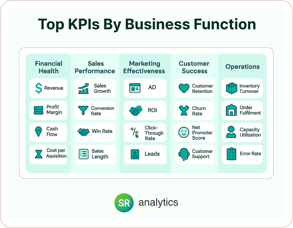
Financial Health
- Revenue growth rate
- Gross profit margin
- Cash flow
- Customer acquisition cost
Sales Performance
- Monthly recurring revenue (for SaaS)
- Pipeline conversion rate
- Average deal size
- Sales cycle length
Marketing Effectiveness
- Customer acquisition cost
- Return on ad spend (ROAS)
- Website conversion rate
- Lead quality score
Customer Success
- Customer lifetime value
- Churn rate
- Net promoter score
- Support ticket resolution time
Operations
- Order fulfillment time
- Inventory turnover
- Employee productivity
- Quality scores
The key is limiting yourself to 5-7 KPIs per dashboard. Research shows that organizations with focused KPI sets are significantly more likely to make faster, data-driven decisions. More than that and people lose focus on what’s truly important. Understanding the fundamentals of effective data visualization becomes crucial when designing KPI dashboards that actually get used.
Building Your First KPI Visual in Power BI
Let’s walk through creating a power bi kpi visual step by step. We’ll use monthly sales as an example.
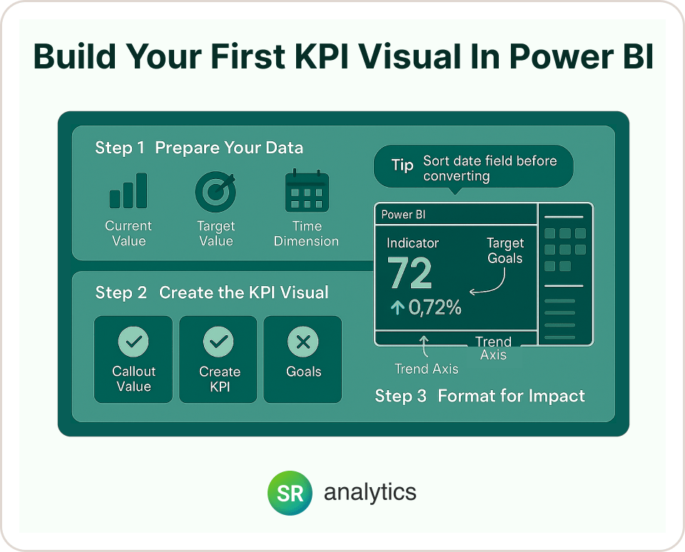
Step 1: Prepare Your Data
Before building any KPI Visual in Power BI, make sure you have:
- Current value: Your actual performance (like this month’s sales)
- Target value: What you’re aiming for
- Time dimension: Dates for showing trends
If your data doesn’t include targets, create a simple table in Excel with your goal values and import it into Power BI.
Step 2: Create the KPI Visual
- Select the power bi kpi visual from the visualization pane
- Drag your metric (like Total Sales) to the “Indicator” field
- Add your date field to “Trend axis”
- Drop your target value into “Target goals”
Pro tip: Always sort your date field chronologically before converting to a KPI Visual in Power BI. You can’t re-sort afterward.
Step 3: Format for Impact
Click the paintbrush icon to access formatting options:
Callout Value: Adjust number formatting (show values in thousands or millions), font size, and alignment.
Trend Axis: Toggle the background sparkline on/off. Set whether “high is good” or “low is good” based on your metric.
Goals: Choose whether to show absolute numbers, percentages, or both for target comparison.
Indicators: Enable visual symbols (green checkmarks, red X’s) that instantly show if you’re on track.
Alternative Approaches
Sometimes the standard power bi kpi visual isn’t the best fit. Consider these alternatives for displaying your kpi metrics:
Gauge Charts: Perfect for showing progress toward a single target, like completion percentages.
Card Visuals: Great for highlighting one important number with custom DAX measures for variance calculations.
KPI Matrix: When you need to show multiple business kpis in a compact table format.
Advanced KPI Features You Should Know About

Power BI Goals (Metrics)
This is a game-changer that most people don’t know about. Power BI Goals lets you create scorecards directly in the Power BI service where you can:
- Track multiple Power BI KPIs in one place
- Update progress manually or automatically
- Add notes about why kpi metrics changed
- Set alerts when business kpis hit certain thresholds
It’s like having a balanced scorecard built right into Power BI.
Dynamic Targets
Instead of static goals, you can create targets that adjust based on context. For example:
- Year-over-year growth targets that increase each month
- Seasonal targets that account for business cycles
- Regional targets based on market size
Use DAX measures with time intelligence functions to build these dynamic benchmarks.
Data Alerts
Set up automatic notifications when KPIs cross important thresholds. This turns your KPI dashboard from a passive report into an active monitoring system.
Best Practices for KPI Dashboards
Design for Your Audience
A dashboard for executives looks different from one for department managers. Executives want high-level trends and exception reporting. Managers need operational details and drill-down capabilities.
When designing your power bi kpi visual layouts, ask yourself:
- Who will use this dashboard daily?
- What decisions do they need to make?
- How much detail do they need to see?
Use Visual Hierarchy
Place your most important kpi in power bi in the top-left corner where eyes naturally go first. Group related business kpis together. Use size and color to show importance.
Color Code Consistently
Green means good, red means attention needed, yellow means caution. Stick to this convention throughout your dashboard so people don’t have to think about what colors mean.
Provide Context
A KPI without context is just a number. Always include:
- Target comparison (are we on track?)
- Trend direction (getting better or worse?)
- Time comparison (how does this compare to last month/year?)
Enable Interactivity
Add filters for time periods, regions, or product lines. But don’t overwhelm users with too many options. Hide advanced filters in collapsible panels.
Common Mistakes and How to Avoid Them
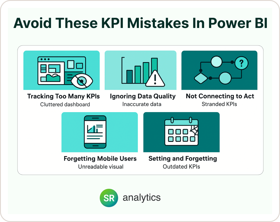
Tracking Too Many KPIs
More isn’t better. We’ve seen dashboards with 20+ Power BI KPIs that nobody uses because they’re too overwhelming. Stick to the vital few kpi metrics that drive real decisions.
Ignoring Data Quality
Power BI KPIs are only as good as the data behind them. Set up data validation rules and regular quality checks. One bad data point can undermine trust in your entire KPI Visual in Power BI dashboard.
Not Connecting to Actions
Every KPI should have an owner and a clear action plan. When customer satisfaction drops, who’s responsible for investigating? When sales spike, how do you sustain it?
Forgetting Mobile Users
Many executives check KPIs on their phones. Make sure your dashboards work well on mobile devices with appropriately sized visuals and readable fonts.
Setting and Forgetting
KPIs need regular review. Business priorities change, and your metrics should evolve too. Schedule quarterly reviews to assess whether you’re tracking the right things.
Real-World KPI Success Stories
Manufacturing Company: A client was struggling with production delays. We helped them build a Power BI dashboard tracking order fulfillment time as their primary KPI. By visualizing bottlenecks in real-time, they reduced average delivery time by 35% in six months.
Healthcare Provider: Precise Imaging needed better resource allocation across multiple locations. Our Power BI KPI dashboard helped them track patient wait times and equipment utilization, reducing wait times by 40% while improving operational efficiency.
SaaS Startup: A growing software company was losing track of their subscription metrics. We implemented a KPI dashboard focusing on monthly recurring revenue, churn rate, and customer acquisition cost. This visibility helped them identify and fix retention issues before they became major problems.
The common thread? Each company focused on a small number of metrics that directly connected to their business goals.
Getting Started with Your KPI Strategy
Ready to build Power BI KPIs that actually drive results? Start small and focus on impact.
- Pick one business area that needs better visibility
- Identify 3-5 key kpi metrics that matter most for that area
- Gather stakeholders to agree on targets and definitions
- Build a simple dashboard with basic power bi kpi visual components
- Test and iterate based on user feedback
Remember, the goal isn’t to build perfect KPI Visual in Power BI dashboards immediately. It’s to create useful tools that help people make better decisions with their business kpis.
Making KPIs Part of Your Culture
The best KPI dashboards don’t just sit unused in SharePoint. They become part of how teams operate:
- Start meetings by reviewing key metrics
- Celebrate when KPIs hit targets
- Investigate quickly when they don’t
- Use data to settle debates about priorities
When KPIs become conversation starters rather than just numbers on a screen, you know you’re doing it right.
When to Consider Professional Help
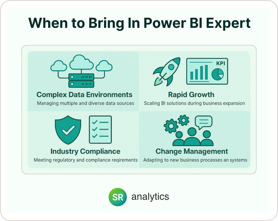
While many organizations can start their KPI journey independently, certain situations benefit from expert guidance:
Complex Data Environments: If your data spans multiple systems, clouds, or legacy platforms, a Power BI consulting specialist can design the optimal integration architecture.
Rapid Growth Organizations: Fast-growing companies need scalable KPI systems that evolve with their business. Professional implementation ensures your dashboards can handle increasing complexity without breaking.
Industry-Specific Requirements: Heavily regulated industries like healthcare or financial services often need specialized compliance considerations built into their KPI frameworks.
Change Management Challenges: If your team struggles with adoption or you’re facing resistance to data-driven decision making, expert change management support can accelerate your success.
The investment in professional guidance often pays for itself through faster implementation, better user adoption, and avoiding costly mistakes that require rework later.
Tools and Resources for Better KPI Tracking
Power BI Features to Explore:
- Goals/Metrics for scorecard management
- Anomaly detection for automatic outlier identification
- What-if parameters for scenario planning
- Custom visuals from AppSource for specialized KPI displays
Integration Opportunities:
- Connect KPI alerts to Teams notifications
- Embed KPIs in SharePoint sites or custom applications
- Use Power Automate to trigger actions when thresholds are crossed
For businesses just getting started with Power BI, check out our guide on Power BI licensing options to choose the right plan for your KPI needs. If you’re comparing platforms, our detailed analysis of Power BI vs Tableau can help you make the right choice for your organization.
Moving Beyond Basic KPIs
Once you’ve mastered basic KPI tracking, consider these advanced approaches:
Predictive KPIs: Use forecasting to show where metrics are heading, not just where they’ve been.
Composite Metrics: Combine multiple data points into single scores that reflect complex business objectives.
Benchmarking: Compare your KPIs against industry standards or competitor performance.
Storytelling: Use annotations and commentary to explain what’s driving KPI changes.
Conclusion
Power BI KPIs work best when they’re simple, focused, and connected to real business decisions. The journey from data chaos to actionable insights doesn’t happen overnight, but with the right approach, you can transform how your organization tracks and responds to performance metrics.
Key Takeaways:
- Start strategic: Choose 5-7 KPIs that directly connect to business outcomes
- Design for users: Create dashboards people actually want to use daily
- Think beyond basics: Leverage advanced features like Goals and predictive analytics
- Maintain momentum: Regularly review and evolve your KPI strategy
The goal isn’t to track everything – it’s to track the right things in a way that drives action. According to recent research, organizations with well-implemented BI strategies see 5x faster decision-making and significant operational improvements.
When done right, KPIs become the heartbeat of your business, giving you early warning of problems and clear signals of success. The difference between companies that thrive and those that struggle often comes down to how well they measure and respond to what matters most.